C&C per req:
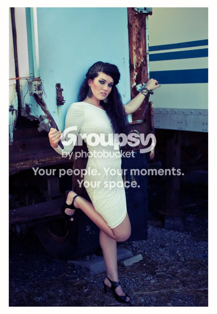
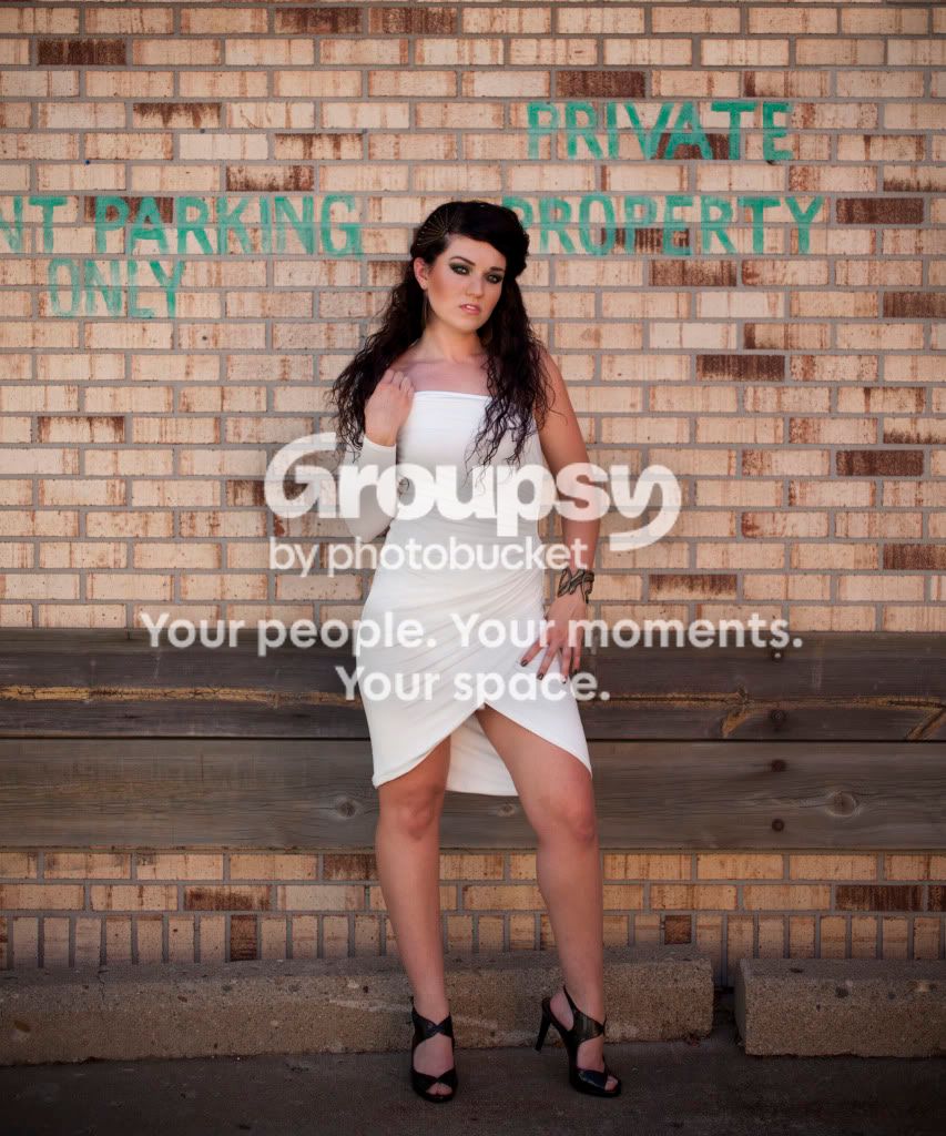
1. A bit of a blue cast to this image. While the model is a very attractive girl, the pose and surroundings here really make me think "lot lizard".
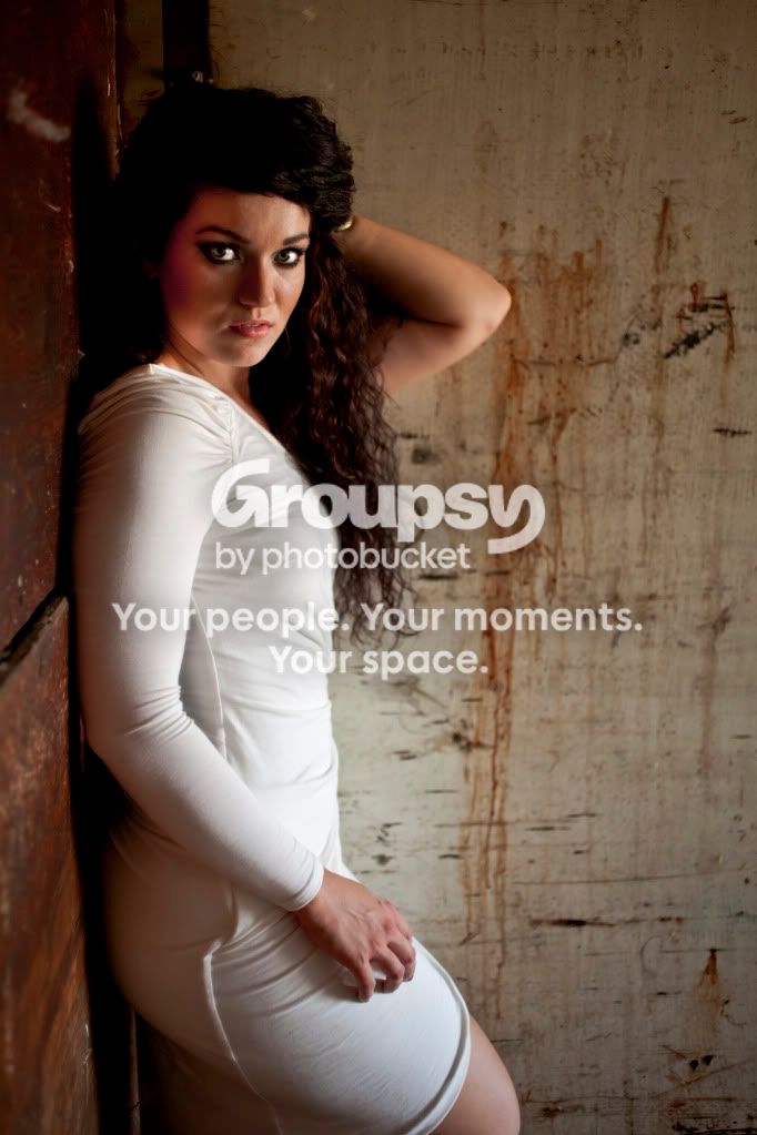
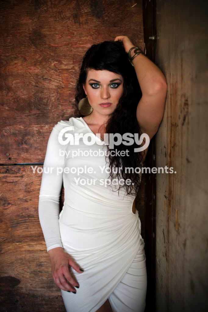
2. Nice, but I find the position of her right arm somewhat disconcerting, in fact it almost looks like it belongs to someone else. I think it would have worked much better if it were sleeved so that the viewer would make the immediate association with the dress. I would suggest a minor levels/curves tweak to tease just a little more detail out of the right (image left) side of her face.
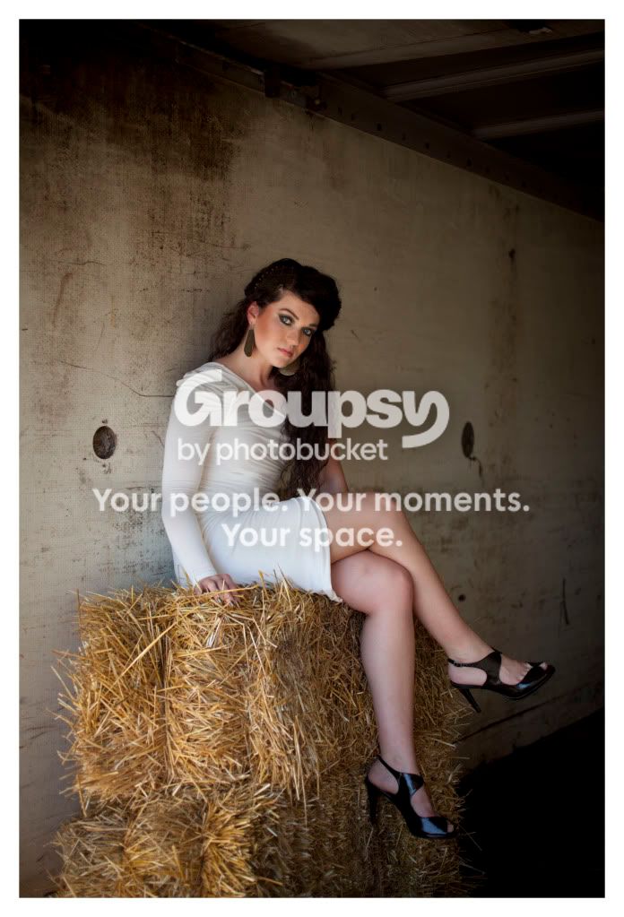
3. Nicely lit, but once again she doesn't seem comfortable to me. Her leg positioning seems awkward and she's leaning forward. The straw seems rather out of place as well.
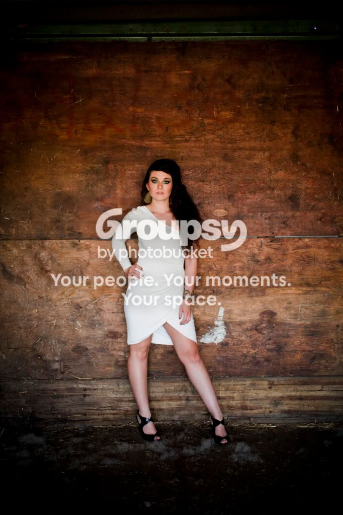
4, 6. Very nice. I really like these two. Good lighting, nice pose, the only two minor niggles are that she's too centered in the image (easily solved with a crop) and that she's too close to the background, which is in sharp focus and distracting. Greater separation would have helped I think.
5. The best of the lot IMO. I get the impression she was unsure of what to do with her right hand, that's minor. Again, I would try and use levels/curves adjustments to bring a little more detail out of her hair, and I think here a crop just below the waist might work.
Just my $00.02 worth - your mileage may vary.
~John