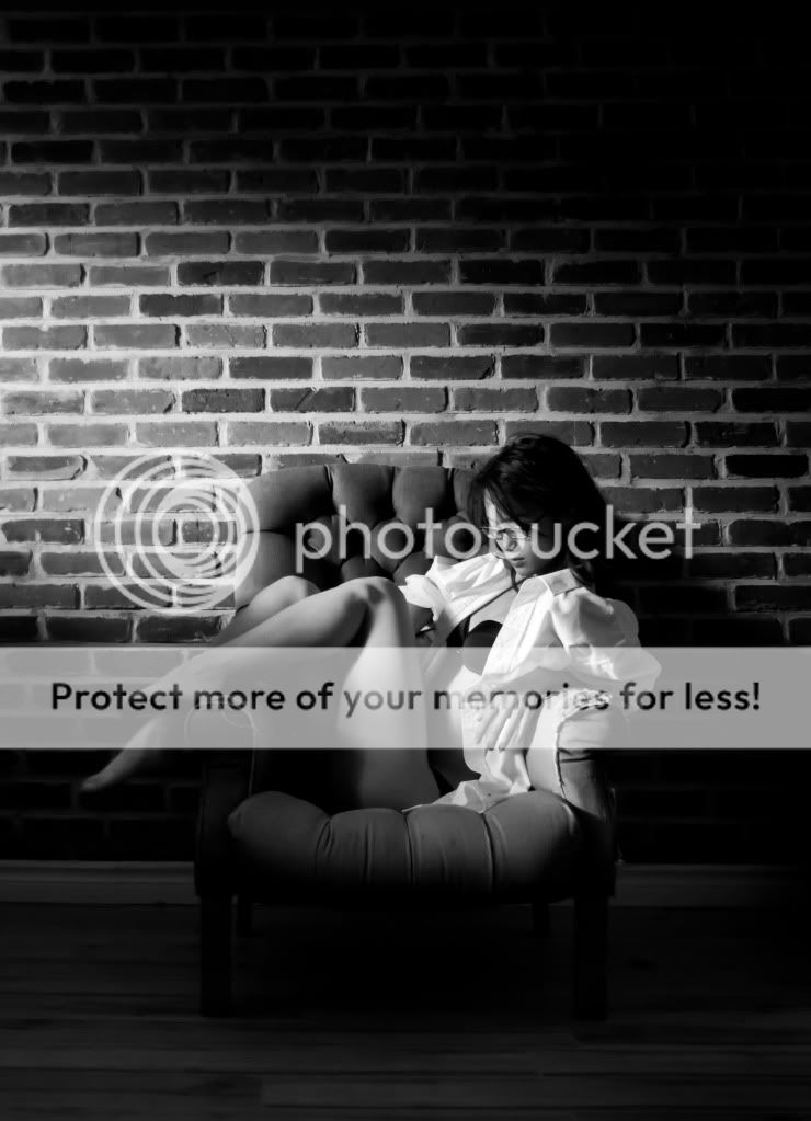
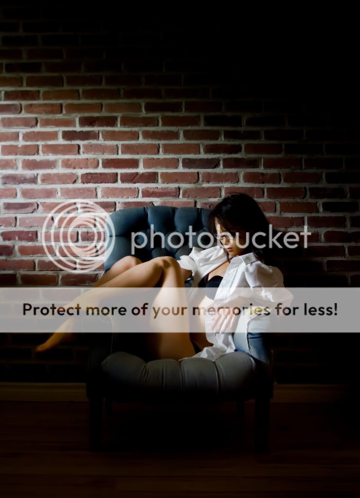
Sunlight on a beautiful model in front of a brick wall

Timoris

No longer a newbie, moving up!
Joined
Mar 14, 2011
Messages
284
Reaction score
34
Location
Australia
Can others edit my Photos
Photos NOT OK to edit
After having shot this picture (third):

I was annoyed that her foot was cut off, something that was pointed out to me after the shoot was done (thank you :), made me pay better attention).
So I decided to retry the shoot, with different results.


EOS 550D / T2i
f/4
1/8 sec
ISO 3200
0 step
21mm


EOS 550D / T2i
f/4
1/10 sec
ISO 3200
0 step
21mm


EOS 550D / T2i
f/4
1/15 sec
ISO 3200
0 step
18mm

Closeup of #1:


I had shot with a fill flash (-2, Camera flash) to decrease the shutter time, but the sunlight pictures are just soo much better.
I also learned that I should really get a mounted flash, better diffuser than my hot-shoe Gary Fog and a Snoot. Snoots are cool.

SO, lets keep fapping to a minimum and C&C to a maximum! :-D

[ADDED]

Pics from later on in the thread, after some modifications.
 
Last edited:
OK, there are currently 91 views, and not one comment or critique?
Am I doing something right?
Am I doing something wrong?
What would you change?
What do you like? (Other than "The picture")
 
I wish it's in color, cus you mentioned sunlight and I am anticipating the warm colors on her.

For the first and last photos, I think you can bring out more details on the dark parts like the legs. May be it's my laptop screen. Those areas just disappears into the dark, which appears a bit "heavy".

Also I kinda wish she didn't have her glasses on. They are rather thick, took some of that sexiness away.
 
You need a reflector to lit up the other side of her. OR you need to stop it down more and have her other side completely dark. Right now the light side of her shirt is blown and also some of her skin on a couple of shots. The range is too great right now.
 
Thank you! :-D
It's things like that that I need. Will rectify and resubmit.
You guys really ARE helping. I need to see the pictures through different eyes.
 
I believe the lighting on the 1st shot needs to be moved a little in front of her as well. I would want to show the entire lines of the legs , you don't have to light them up as much but light them up enough to show the lines of the body. The shirt is creating a shadow on her arm that is distracting, the arm of the chair is creating a shadow as well. The right arm is disappearing between her legs and we don't know what is happening there, almost like she dropped something. The knot on the side of the knee area is distracting and not pleasing to the eye - light it up and get rid of that shadow to keep it from showing up too much. You want a woman to show the side of the hands not the back of the hand as the side or palm is more pleasing to look at. Maybe have her drop the shirt off the shoulder to give it a different look and see what that looks like.

-
Shoot well and thanks for sharing, Joe
 
Thank you Joeal.

Although some of those fixtures I can not fix with the existing shots, I am taking them into consideration for with my next shoots :-D

As for what I could fix, I have taken out the lamp (YAY content-aware!) and retouched her foot, but just enough for it not to be lost. I was afraid that it would look weird.

"How do you know when to stop?"
"When I do too much, then I know when I should have stopped."

Because of the quote above, I did not touch the arm shadow, it just looked, weird. Plus, even as RAW, making it better gave way to image degradation.

OnChair4-7553.jpg


OnChair5-7553.jpg
 
Hmm.. it looks like it is blown due to your B&W conversion. Your color photo looks better.
 
Color wins!

Black & White has feinted!

Although I do like how Blowout makes for a nice, clean white, I can understand how there is loss of definition and how it distracts and takes away from the image.

You have all been helpfull, than you :-D
 
I like the B&W (although the color is nice as well) version they imply a mood that fits the pose and seine (maybe a tad more light #1) would bring out detail, but not too much then the mood would be lost. Crop out the light on the wall (distracting) or set a low power flash inside to appear as she is using that light to read from. Keep it in # 3 adds detail. One other thing it looks like your DOF may have been a little too much or focus point off a bit. Her face in all of them seen to be off just a tad or maybe its just the softness.

Stunning model by the way (had to add that in)J
 
Personally speaking, I like the glasses; I think they add to the young lady's appeal rather than detract from it. Maybe that's because I spent 7 years living in Hong Kong in the days before contact lenses (the dawn of time) and it seemed like 90% of the respectable pretty girls wore them. Very nice shot in my amateur opinion.
 
I wish it's in color, cus you mentioned sunlight and I am anticipating the warm colors on her.

i agree with this. you lose the sunlight that you felt was worth mentioning.
 

Most reactions

New Topics

Back
Top