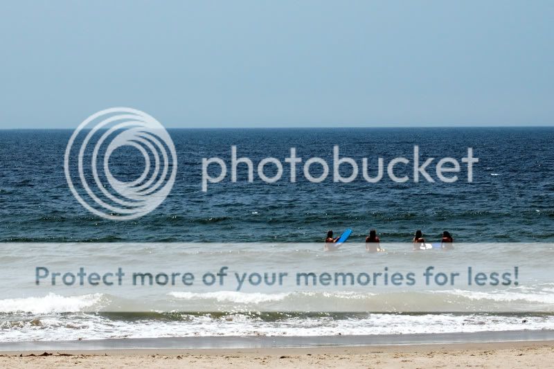
does this composition work for you? I tried cropping out sand completely but then the surf comes very near to the edge of the shot and does not look good.
To me, this composition is really close. I do think there needs be a lot of extra "negative" space around the surfers, but i think there is too much sky in the one you've posted. I played around with the crop a lot and can't decide which way to go. What I think looks the best is cropping out the surf and placing the surfers in the extreme bottom right of the frame, but that loses a sense of place. The other option i've found is taking off some sky and some stuff on the left to just tighten up the crop a little bit, but not too much.


![[No title]](/data/xfmg/thumbnail/36/36303-10b1a386a9a00cf90fb7605d2d2c48c1.jpg?1619737497)


![[No title]](/data/xfmg/thumbnail/41/41755-a922f39cc29ff8f6e66a197508bf99f3.jpg?1619739881)
![[No title]](/data/xfmg/thumbnail/36/36301-27972c0474532c2ef657014362950733.jpg?1619737495)
![[No title]](/data/xfmg/thumbnail/36/36300-760519cb9a8ebbfc57cc3d1fda5dd37c.jpg?1619737494)