What's new

Survey

unpopular

Been spending a lot of time on here!
Joined
May 17, 2011
Messages
9,504
Reaction score
2,004
Location
Montana
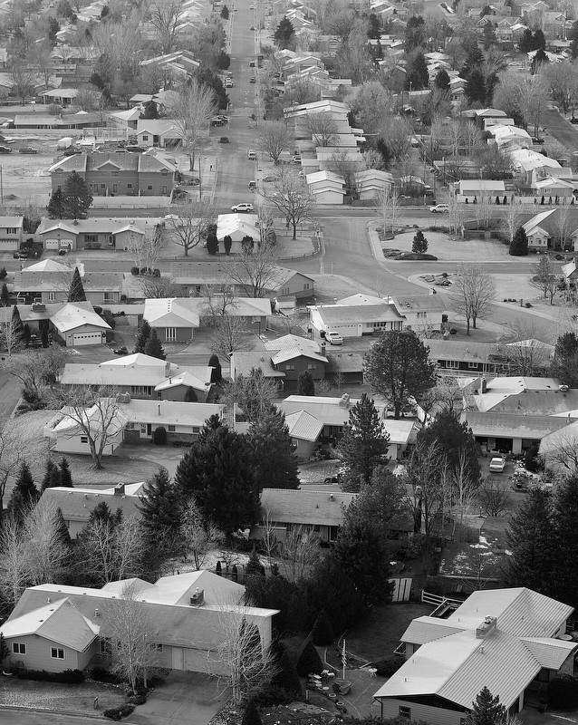
Let me know what you think of this one. Do the lines lead, or do they lead away?

What initially interests me is the juxtaposition between the ordered blocks and the houses in the foreground that are at off-angles. That and the frosty-white roofs.
8274541986_72f6c66a20_b.jpg
 
Last edited:
Hmmm. I don't know to think of this one. My eyes keep wandering the photo looking for something to look at. Although I appreciate your concept, I just can't find anything that keeps my attention.
 
To me, the bigger (dark) trees in the foreground do offer something for my eyes to rest upon, but then I'm not sure that leading lines lead anyone's eyes from the top towards the lower areas of an image (never learned these kinds of things)? Does it matter or does it not matter where lines start? True question here.
 
I have to agree that it doesn't seem to be leading me anywhere. It's also a little flat - might need to be a little lighter in the highlights and darker in the mid-tones.

I'm just guessing here, but maybe having more of the ordered part and less of the chaos would be more effective?
 
The curved road and dark tree kind'a take my eyes the the center of the photo, But then there's really nothing there to focus on.
 
My eyes keep darting between the centre road at the very top with the white roofed house at the bottom of the road and the dark trees at the bottom of the image
 
A degree of visual uncertainty is desired in this image, I don't want the eye to "land" anywhere, it's not about one or the other, but both. For me, Rick's assessment is something that I'm worried about, the trees being too dominant. I wish that there was something to balance them in the diagonal adjacent corner.
 
My eyes don't know where to go or what to focus on. I find it too busy. (just my humble opinion)
 
I love canned replies to my images, like "it's too busy". Not everything is or should be harmonious, comfortable or compositionally pleasing.

If your eye wanders, then my concerns about the trees in the foreground being too dominant isn't an issue.
 
It would be much better in color. I think.
 
I don't see this image so much in terms of lines, but rather texture. If this was a new development with insignificant trees it would strengthen the effect IMHO. The b/w works for me, as it simplifies.
 
My eyes wander on it. There's no definite subject to focus on. Just my 2 cents.
 
it's a little muddy.
 
My images? Muddy? Never!

(fixed and replaced)
 

Create an account or login to comment

You must be a member in order to leave a comment

Create account

Create an account on our community. It's easy!

Log in

Already have an account? Log in here.

New Topics

Back
Top Bottom