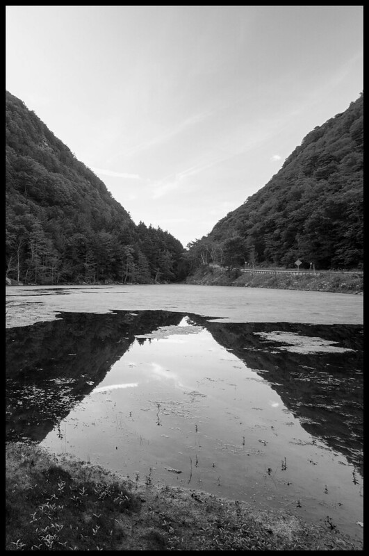
Hmm. I was initially looking at this on a Chromebook with the screen tilted a little, which rendered the hills as almost a silhouette. Correcting that, I found the picture almost insipid.
I want to like it, I really do. The geometry is quite wonderful, and there's a lot of nice tonality going on in it. Lots of interesting areas of one tone and another, lots of reflected material -- nicely broken up with a modicum of non-reflected material. The foreground rocky area anchors the frame nicely. If it were mine, I think I would do a bunch of burning and dodging (I am sure you are SHOCKED, SHOCKED to hear that!) with an eye toward organizing the tones into a dominant light area (probably in the sky, at the point of the V of hills) and a dominant dark area (possibly that rocky area in the foreground? Not sure, though) and then subordinate light and dark areas that try to echo elements of the dominant areas. It feels to me like it wants more heirarchy, basically.
I'd also render the tree-covered hills quite a bit darker, but that might be merely because that's how I first saw them and I quite liked that first impression.






![[No title]](/data/xfmg/thumbnail/32/32981-27e3d29bfa5b1638f18299ec111c7b87.jpg?1734162931)