What's new

The Future is Unknown

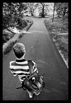
The hilights are just blown. not much you can do about that now, better to keep them where they were.

Shadows look odd, and are prob too light now anyway. Do you have a color version? A lot of time it's best to control shadows in greyscale conversion...
 
did you edit the one you posted , or go back to the raw file?

I like that the rocks don't jump out and hit me like before. The cannon logo didn't really bother me...but I can see others' point with it.
 
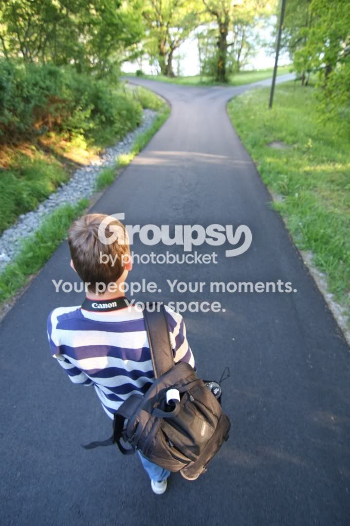
Okay. Here's another one. I'll add a colour version (but it's not the best quality).

IMG_3962.jpg


Framtida er uviss 3 by Anders Myhre Brakestad, on Flickr
 
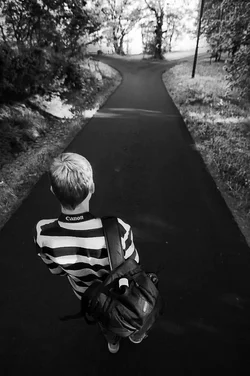
Hey compaq...how do you feel about darkening the back of the path slightly...especially on the right. It almost seems as if there is a "hint" of which path he should take as its a bit lighter, almost indicating he should go that way.

To me, I feel he should be "brighter" than the end of the path to illustrate that he has to chose...not have the path, or the end, lit up to emphasize the choice to make. Should be a bit darker and weary...to stress the "unknown" portion as your title suggests.

If that makes sense.


Just using your pic to practice...lol...wondering what you thought.


$path1.webp
 
these little pics kinda suck when viewed in the thread, lol. when i preview them and flip back and forth it looks better. at first glance of my post I was like "did I upload the wrong one" lol almost couldn't see the changes.
 
Every time this picture was edited my heart broke a little more.
 
The original is my favorite.
 
Here is a quick adjustment. One thing which caught my eye is that the path has a bluish tint. This can be used with the channel mixer to adjust tone selectively. I also opted to make the road darker, rather than lighter. I think this works better because in order to create contrast between the already dark path and the shady trees, you'd have to darken them to the point that they become nothing but black blobs.

$IMG_3962.webp

It's far from perfect, but it's what I could do with the time I wanted to put in and the 8-bit file. I'd probably introduce more detail into the pavement, and work on the hair more if I had time.
 
I do like the darker path better than the light one. Good call on that. Wasn't even thinking in that direction.
 
I sort of prefer the lighter road. I tried something like this, but decided on the lighter road. It's all taste, though. We could probably discuss what would be best for weeks. I appreciate the feedback, I've gotten more to think about when editing shots from this thread :thumbsup:
 

Create an account or login to comment

You must be a member in order to leave a comment

Create account

Create an account on our community. It's easy!

Log in

Already have an account? Log in here.

Back
Top Bottom