invisible
Been spending a lot of time on here!
- Joined
- Mar 10, 2007
- Messages
- 5,213
- Reaction score
- 983
- Location
- Canada
- Website
- www.federicobuchbinder.com
- Can others edit my Photos
- Photos NOT OK to edit
Follow along with the video below to see how to install our site as a web app on your home screen.

Note: This feature currently requires accessing the site using the built-in Safari browser.
ooo, if we're voting to clone out things, can someone clone out my lack of hair?
Wait. Does that work?
Crap.
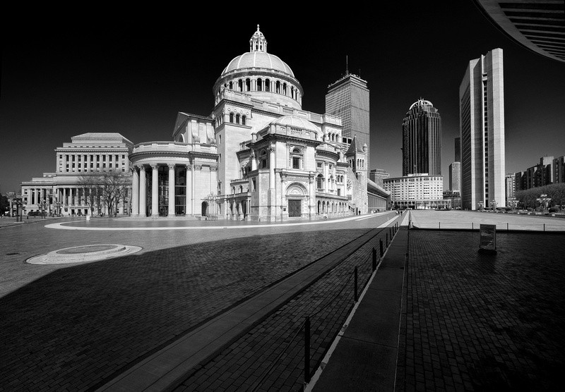
It a really nice shot, but:
- The main subject (and title) is mother church, however lines guide my eyes to the building in the background.
- Further, the church is overexposed. I guess you could fix that in pp.
I was just lucky. There was barely anybody around, which was surprising...Not to mention pretty good timing so as not to get any pedestrians in the way. I thought perhaps you did the 10x ND trick, and made them vanish, but you did shoot at 1/200sec, so that wasn't it.
I didn't give them the chance to harass me took the camera out of the bag, snapped a couple quick shots, and put the camera away... all in less than a minuteDid they harass you at all? Stupid church officials will kick photographers off the property.
")
Thanks, Paul. Spot-on analysis for the most part, the exception being the reason why I took this photo. I didn't really have in mind "religion versus commercialism". There is a bit of a story, though. I spent a year in Boston back in the early 90's as a student. Every time I would pass by this church I thought that the juxtaposition of old and new architecture was horrendous. I'm referring in particular to the use of tempered-glass doors between those old-style columns, a detail that can't be seen in my photo. So when I visited Boston again last year in a memory-lane kind of trip after two decades, I stopped by this place. It looks like my taste in architecture has evolved, because not only did I not find this horrendous anymore, but I almost liked it. The place looked somewhat different than 20 years earlier, so I decided to take a photo to show my old Boston friends (international students just like me, now back in their countries) how this corner of Boston had changed.It a really nice shot, but:
- The main subject (and title) is mother church, however lines guide my eyes to the building in the background.
- Further, the church is overexposed. I guess you could fix that in pp.
Actinometro, I think both things you mention are intentional. The leading lines do point to the dark building, but it is both visually smaller and darker than the church, giving us the hint that the church is more important than the dark building. You could read into this image that the Religion trumps commercialism, although I do not know what Federico was thinking when he made the image.
As for the brightness of the church, I dont think it is over-exposed in fact the post-processing appears to be very careful to place the whites just inside the right edge on the histogram, where the detail is visible. The only place where there are true blacks is in the sky, and again this appears to be very deliberate. The rest of the image has a very good range of greys. Therea good reason why Federico directed us to his site which portrays the image surrounded by a dark background.
Much appreciated, Rob. I don't know if the image is that good, but I can say that I'm happy with itI like this - it is a very surreal image, each building is in itself unique, and they almost look like they have each been cut and carefully pasted in their position to give this extremely pleasing composition.
Clearly, I know this is not the case, and kudos to you for seeing this POV - one of the best BW's it can remember seeing in a long time.
Well done sir!
EDIT : image nominated for Feb 2013 Photo of the Month (...in a heartbeat!)


![[No title]](/data/xfmg/thumbnail/33/33338-4ae29c5eff506820d8b986c033234764.jpg?1619735908)
![[No title]](/data/xfmg/thumbnail/32/32811-2108d3f1ed7b5806eb452fc776aac668.jpg?1619735670)
![[No title]](/data/xfmg/thumbnail/32/32171-96317e1f56adbfbcf5a9205247a8c2fc.jpg?1619735234)


![[No title]](/data/xfmg/thumbnail/32/32810-094482c1ef1c76eae62a96107013a72e.jpg?1619735669)