The Whole Series

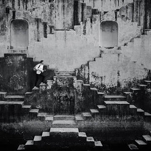
The last 3 shots look interesting to me. Why I am not sure yet.
The rest just dont have enough pop, contrast or sharpness to them to get me
going, but that doesnt mean they are bad, who knows..

I think something about the last 3 give it a timeless classic feel.
I expect her to drive off in james deans car...
 
I think it's the gloves.
 
I have just read most of the posts and Im cracking up!!!! For someone that doesnt mind leaving critiques, whether rude or constructive, you seem to have a problem taking them. I have read several that you have left and they are not always "NICE OR CONSTRUCTIVE!" I felt like I was in the girls bathroom at a high school.....lol!

That said, great series =)
 
My general approach to looking at a series is to view the photos first and read what the OP has to say about their post. I do this before reading what others’ opinions are, if present. This is for two main reasons, 1) I’d rather not have my initial assessment influenced and 2) I want to hone my skills at reviewing a photograph, by waiting to read further down in the thread and to see what others have noticed, particularly those that have a keen eye to detail.

Here’s my nickels (inflation) worth.
For the entire series: the wardrobe, hair styling and location are excellent. The lighting is a very nice complement for these images except as noted.

#1 – Everybody has their favorite, but this is mine. The pose, lighting, puff of her hair (as if wind blown). I like the way you caught the dark shadows from the bottom a literally forcing my eyes up and to the right to the models face. The shadow that crosses her upper torso seems to force her against the wall (a little seductive). You still have plenty of light on the shadow side of her face to see detail. Then, the dress, the way it is sprawled across the entire width of the steps is appealing, but the sheerness of the fabric, where we can clearly see the outline of her leg is very seductive.

#2 – This is out of character with the series by her smile. Although it is “light”, details of her skin are visible.

#3 – My least favorite of the lot. Awkward and stoic are accomplished for the models pose, but IMO it does not let the dress fall in a flattering way. The use of color in this series is useless and adds no value. The power lines in the window on the left are distracting.

#4 – Again, the pose is not pleasing to me. I have seen the wide stance, full-on look by girls before, but it was generally used as a method to stabilize. Adding some motion blur would a captured it completely.

#5 – This is a great shot with one exception. The lighting on the inside of her right leg is overexposed to the point that it appears she is standing on a toothpick. Again, the sheerness of the dress is quite seductive.

#6 – As above and of course, plus the crop.

#7 – Other than the crop, this is very nice looking.

Now, with regard to the other parts of this thread, I have no idea how much work you had to go through to get these images. After reading your explanations, I applaud you with your knowledge and craftsmanship with the media.

But in all seriousness Max, you had to know there would be a big red bullseye on your back from certain posters. While you can give some well seasoned advice to those that have not reached your level of expertise, you do have a tendency to be short, blunt and rude in your critique. You seem to thrive on being provocative, controversial and waiting for the opportunity to counter with your quick tongue, shorter fuse and mastery of the English language. I look forward to your first or second reply to a thread where you give solid comments and advice, guiding the photographer to stretch the abilities and imagination. Much beyond those two it becomes a bitchfest and I get extremely bored. You may not see this behavior in yourself, may not care if you do, but nonetheless, people skills fall short on your list of attributes.

I’m not having a dig Max; I just want us all to get along. Balance.

Is this still going on? :scratch:
One more please!
 
I think the second view is a real stand-out. I like that the clothing and background are in key. I like too the low ratio lighting, affording detail in both highlights and shadow. I wonder about a slightly different pose... maybe her right placed beside her, allowing her arm to create a diagonal line, rather than vertical. Nice image.

-Pete
 
Cool. Thank you.
 
Sheesh with black gloves on in the last few she should at least have a weapon... otherwise white gloves.
 

Most reactions

New Topics

Back
Top