Thoughts on "Color Splash"?

tHarpKS

TPF Noob!
Joined
Dec 17, 2011
Messages
20
Reaction score
1
Location
Florida
Can others edit my Photos
Photos OK to edit
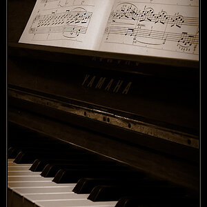
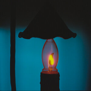
What do you think of "Color Splash"? Useful? Or just dumb?

Here's an example of what I am talking about if "Color Splash" isn't what it's called.

IMG_0376.jpg


IMG_0356.jpg


Thanks!

Thomas

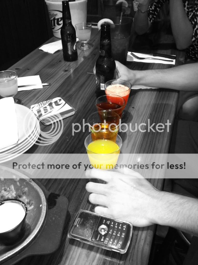
Excuse the excessive amount of alcohol.... it just so happens these are the only two I have for immediate use with "color splash" effect. :angel:
 
It depends on what you are going for. If your aim is to draw attention to the liquid, mission accomplished. I'm not a pro by any means, but I think it's a good use of it. I think its called "selective color" but I'm not 100% sure.
 
Many people here will agree with Selective coloring is dumb, and very rarely used.. It should only be used on 1/1000 photos in my thoughts. I just think it's overplayed
 
It's called selective coloring, and everyone here seems to hate it for some reason. I think it's useful sometimes, but it's gotten a little played out? To me it seems to work best in like product photography, and advertising. I rented this hilarious little Ford Fiesta in lime green once, and the users manual had a photo of the car in selective color on some city street. In that situation it worked really well I thought, on the cover a user's manual.

I like the first photo you posted, if it was going to be used along with some description or recipe for those drinks.
 
Not a fan of selective coloring, mainly because it's always done horribly.

That being said, I think you're on the right track. You've put the subjects in color, not some arbitrary piece of furniture in the back ground.

THAT being said (lol), I don't think it's enough to save either photo. These are more-so photoshopped snapshots.

Keep working; for a first try, I'd say you did better than most do.
 
I don't hate it. Well, I do when it's done poorly. It has to make the subject stand out, not the shirt or something other than the subject. These are decent uses, not the greatest photos to begin with... THe color is accentuating the subject of the image. The beer one could use the can in color too. That one is kinda weak.
Most people will color the shirt or a flower bush or something that is not the subject of the photo. The color just makes that item the subject instead.

If you couldn't understand what I meant, just read the above post; exactly what I was trying to say :)
 
Yep. The beer can should be in color too, and the beer in the glass should have a head.

The final touch would be to put a white card behind the glass of beer so the dark table doesn't show through making the beer look more like old urine than fresh beer.
 
Last edited:
Yep. The beer can should be in color too, and the beer in the glass should have a head.
OH YES! Kinda looks like... recycled beer.
 
When I see selective color I think of "Adobe Elements" and 1997. Selective color was one of the very first "creative effects" in the early days of digital image manipulation, and it was played out over a decade ago. That's what I think of...the very early, early days of digital image manipulation...
 
Last edited:
Yep. The beer can should be in color too, and the beer in the glass should have a head.

The final touch would be to put a white card behind the glass of beer so the dark table doesn't show through makeing the beer look more like old urine than fresh beer.

Keen observation!
 

Most reactions

New Topics

Back
Top