I think selective color images have a place like a lot of alternate styles of photography. I've seen and used selective color mostly in nice portraiture work but I think it looks more appealing when it is subtle. (think of a portrait with that porcelain look). Customers like it, so I have used it. I have seen a lot in advertising that I thought were very creative.
The cup of beer looks like is has condensation on the outside and is making the beer look flat, on top of what everyone else said.
As for the artistic merits of colour selection: as with all art, the use of and opinion on the technique varies from piece to piece. Also, ask yourself who you're creating the art for? If it's for yourself, why do you care what other people thing? If it's for other people, you should find out what they like before you create (in general).
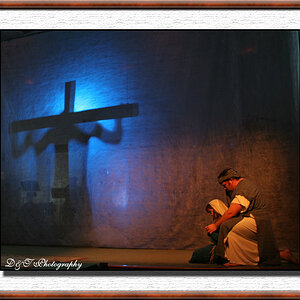
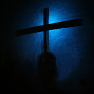
People who say selective color is stupid and shouldn't be used are akin to those who said digital is stupid and only film photography is "art". Selective color is a tool, and any tool when done too much can become passe or lose it's impact. I've taken tens of thousands of images and I can count on one hand the number that I've used selective color on, this one being one of my favorites:
IMHO, selective coloring is a gimmick for selling to people who don't know any better.
This reminds me of a recent post in a different part of the forum. Just because people will buy (what I feel is) crap, doesn't mean that it's good photography or "art".
If people buy it because they like it, then the creative process that created it has been validated. That's like saying McDonalds isn't food even though they serve billions of people around the world.
No idea why, but Sporty was always my favorite. Complete butterface (or as my bro would say "a fifty yarder"), but those backflips are pretty wicked lol
Some of their album stuff isn't all that bad. Campy, definitely - and not good enough to discredit my assertion above - especially since people who bought the albums would just play Wannabe on repeat for weeks straight.
But the songs you you would hear on the radio are just HORRIBLE.


![[No title]](/data/xfmg/thumbnail/31/31740-83040d547efdbb1f87736f24d2e9985c.jpg?1619734985)