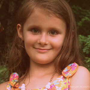
I like what you were going for with the first image, and I like your original edit better. However, it feels very out of focus to me. Her bracelet looks sharper than her eyes, and even then, it doesn't look like it's quite in focus either.
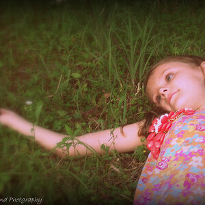
I don't like the second one at all, unfortunately. It seems like too much fake post-work. I get what you were going for, but it doesn't feel cohesive. This image is also UBER soft... I can't tell where the focus point is in that one at all.
It *may* have something to do with the way this damn site uploads images, and the fact that I'm on a retina display, and the fact that you probably uploaded websized images... so I'd be curious to see what the files look like outside of this post, to see if I'm still seeing the same "softness"/focus issues.






![[No title]](/data/xfmg/thumbnail/37/37136-40f690dc7da693c09d7c99c3782954b8.jpg?1734169835)


![[No title]](/data/xfmg/thumbnail/35/35928-33efa691642c029d54412fa1dc22b78a.jpg?1734167717)