Thread may be too graphic for treehuggers

Flower Child

TPF Noob!
Joined
Oct 19, 2008
Messages
778
Reaction score
4
Location
Southeastern Kansas
Can others edit my Photos
Photos OK to edit
destruction.........


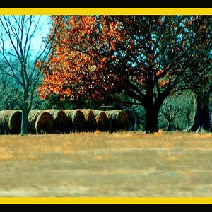
im upset about this, very upset. i have done a lot of my shooting here in these woods. i snuck out here one day when the bulldozer guy left and snapped a few.

i added a strong yellow tint to both. i liked it myself. what do you all think? which is better?

1.
bulldozer015.jpg


2.
Copyofbulldozer008.jpg
 
i dont like the yellow tint on the first one at all. but i think it works great and the composition is great on the second one.
 
Its a personal taste I know but I really dislike the yellow tint. I am not a big fan of a lot of the artistic treatments like this one though so its nothing personal. I actually think this could look quite good as a B&W conversion though.
 
I agree - I think the yellow is just too powerfull in the first shot, but it works well in the second. Though I don't really know if the yellow is the right colour tint or even if it is needed, but then that is your choice.

A shame the site was bulldozed!
 
thanks overread for the comments. yeah it is a shame, a farmer wanted more farm ground thats why its getting dozed.
 
Actually I like the yellow tint on 1 because it gives it like a bio-hazard feel to me and with the bull dozer you can feel the destruction when you look at it. That's me atleast.
 
Well thats good! at least its not going to houses!

haha. well i think our town could use a few houses getting dozed. hahaha

Actually I like the yellow tint on 1 because it gives it like a bio-hazard feel to me and with the bull dozer you can feel the destruction when you look at it. That's me atleast.

thats great im glad you liked it thats what i kinda thought too. i wanted to give it a certain feel like that. i appreciate you commenting
 
ron, it was upsetting knowing how long it took for those trees to grow to the size they were and that single bulldozer had them leveled in about 3 days work

here is the natural colors. i dont know--you guys may like this better, but i just thought that the yellow breathed a little life in the photos

bulldozer009.jpg


bulldozer012.jpg
 
Last edited:
As suggested above, I thought it would look better in B&W, so since you said its ok to edit your photos, I took a shot at it:

bulldozer009-1.jpg


Very nice composition, mabye just a bit overexposed on the top half, but it looks great in B&W I think.
 
thanks robbie, i like your version also. ill probably end up printing both of them
 
err steez you forgot the .jpg off the end of the lable
but something tells me that you might have posted it in the wrong place ;)
I also are more input for your flower - though it will have to wait till after the potatos have boild
 
this image right:
Picasa Web Albums - Ian M - On Location
?
only seems a bit of random placing.

As for flower - the original photo is showing a lot of overexposure in the middle - where you have the most light - you can see it on the front of the dozer very well. The black and white and yellow tint versions do a good job a covering over this limitation with the shot.
Shooting during the daytime can be tricky when there is too much lighting and the sky is clearly in a shot - this thread here might be of help

http://www.thephotoforum.com/forum/...-filter-keeping-skies-being-over-exposed.html
 

Most reactions

New Topics

Back
Top