What's new

Three Beautiful Girls

fjrabon

Been spending a lot of time on here!
Joined
Nov 3, 2011
Messages
3,644
Reaction score
757
Location
Atlanta, GA, USA
Can others edit my Photos
Photos OK to edit

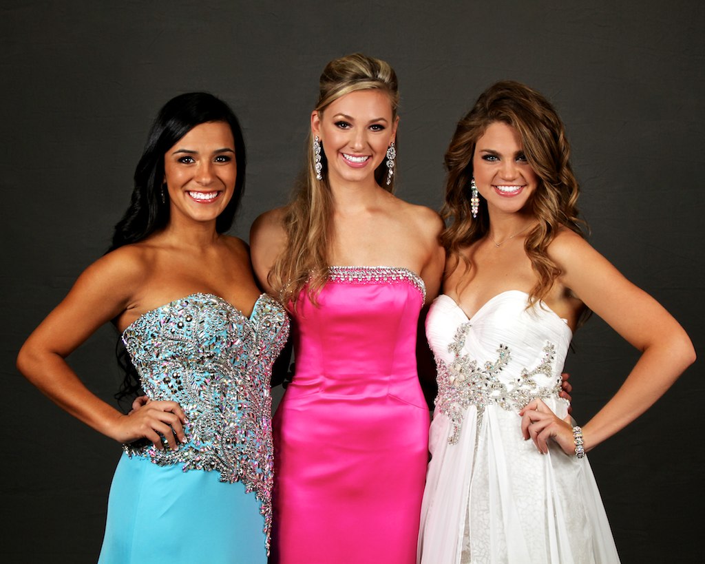
IMG_6994 by franklinrabon, on Flickr

Most creative thread title ever, huh?

And yes, I realize that the background needs to be cloned as smoother, it was an on location shoot, so there was really no way around a slightly wrinkled background. Our post people will fix that. Mostly getting thoughts on the other aspects.
 
texkam said:
As a snapshop, you nailed it.

What made it not work? Something is off about it and I can't quite put my finger in it. Hence why I posted it.
 
The lovely lady in the pink, her skin tones differ from right to left. Her right shoulder looks like ummm mmmm a mans, sorry no other way to put it, and the girl in the white looks like she has not shaved her armpits .....
 
It looks fine to me. The only thing I see are the harsh skin folds leading into the the armpit of the girl on the left. Being I know nothing about portraits, that may be completely acceptable. I can only say to me it stands out.
 
One minor thing is that the middle girl has her hands around the waists of the other two girls. On the girl in white there is some separation between their hands but it makes the girl in blue look like she has a broken extra finger sticking up.
 
As a snapshop, you nailed it.

fjr - there is no reason to even paying attention to one liner comments like this, positive or negative.

---

The only thing I can see wrong is WAY too much contrast. I know what you're thinking, and maybe you're right to some extent. But take a look as if I'm not the one saying it. The skin is too deep, and warm, the dresses are blown in at least one channel and the woman on the left, I'm guessing she's more a brunette than jet black and even if I'm wrong here, there is no detail whatsoever aside from the hilights.

What's "off", I think, is a tonal subtlety.

As far as being "snapshoty" no way! It's a good pose, the girls are natural and showing a good bond between one another - something you manage very well in a lot of your portraits, iirc. The lighting is basic, but not "flat". You just have some contrast and saturation issues.
 
unpopular said:
fjr - there is no reason to even paying attention to one liner comments like this, positive or negative.

---

The only thing I can see wrong is WAY too much contrast. I know what you're thinking, and maybe you're right to some extent. But take a look as if I'm not the one saying it. The skin is too deep, and warm, the dresses are blown in at least one channel and the woman on the left, I'm guessing she's more a brunette than jet black and even if I'm wrong here, there is no detail whatsoever aside from the hilights.

What's "off", I think, is a tonal subtlety.

As far as being "snapshoty" no way! It's a good pose, the girls are natural and showing a good bond between one another - something you manage very well in a lot of your portraits, iirc. The lighting is basic, but not "flat". You just have some contrast and saturation issues.

Thanks. I actually lowered the SOOC contrast/saturation a nudge, it was actually about the only adjustment I made other than smoothing the background a little. Ill perhaps play with the contrast a bit as well, though for the shot that 'gets sent' I don't control that, that's up to our image editors. And they usually like contrasty, saturated images. Because people are more likely to buy them I guess.

The girl on the left was pure jet black hair, Native American/ Hispanic. She was stunning, her individual picture does her much better justice, but I guess an individual should.

The main reason I responded was something just didn't seem right to me with the shot, but I couldn't quite put my finger on it. I dont really ever take offense to C&C here. Also I try to be open minded. However much we may disagree about things stylistically I know you know your stuff and your opinion is always one I like to hear, because it gives me another angle. I'm confident enough in my photography that I can listen to dissenting yet informed opinions and decide if/how I want to incorporate them.
 
SCraig said:
One minor thing is that the middle girl has her hands around the waists of the other two girls. On the girl in white there is some separation between their hands but it makes the girl in blue look like she has a broken extra finger sticking up.

Hmm yeah. I kept saying hands on middle of the back, but all the girls wanted hands around hips, haha. At some point the lines started backing up and I was a lot less if a stickler for that. It's always a tough balance at events like this. You realistically have a max of like 2 minutes to get the shot posed and taken. Which isn't a whole lot with 3 girls who are all gorgeous and need to be accentuated to the utmost.
 
Murasaki said:
The lovely lady in the pink, her skin tones differ from right to left. Her right shoulder looks like ummm mmmm a mans, sorry no other way to put it, and the girl in the white looks like she has not shaved her armpits .....

Hmm perhaps I need an armpit light.
 
The gal in the middle has no arms, and the other two have fingers growing out of their waists. I'm not sure what the one on the right is doing with her left hand.
 
Take a look at this edit here. It's quick, and probably too blue... but:
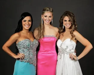
$8149688377_dae44e3636_b-1.webp
(be sure to click the preview for CM version)

I won't go into specifics on how I handled saturation since the tools I used aren't available in Photoshop, but they can be managed using hue/sat. I will point out a few things that I think would help.

In the original, the skin saturation ranged from 35% - 40% in the hilights and 65% - 95%(!) in the shadows. This means that in the shadows, their skin tone has more saturation as their dresses!

The big adjustment I made was was using the Channel Mixer. I chose the channel mixer because the two dresses while having blown detail in at least one channel, at least one channel also had detail. The setting I used was a global 60, 50, -20, greyscale conversion and placed on luminance mode. If I were doing this, I may want to address each dress separately and mask. Certainly I'd mask the dresses in away from the skin.

because in RGB tone and saturation are intrinsic, when dealing with color sensitive adjustments, I will often apply tonal adjustment layers on "luminance" mode and if necessary copy the adjustment and apply in "saturation" mode, this allows me to to kind of decouple the two properties and adjust them independently using opacity, that way I don't get into weird saturation issues when increasing contrast resulting in the "orange skin syndrome". You can even adjust the curves separately to adjust if the shadows are too saturated relative to the other regions.

Overall though, I do think the skin is a bit too "rich" even having adjusted saturation, and addressed this with a very slight curve adjustment to the mid-highs, bringing down blue by a few points and very slightly pulling red. A little bit goes a long way with skintone.

Lastly, I think one thing would really help is to remove the warm cast in the background. This will further provide depth to the image as the eye perceives higher saturation and warmer colors as foreground.

Obviously if this were my image I'd take more time masking and fine tuning. But I do really think it's too punchy. As you can see you can still there is plenty of room for rich, bold colors, and I know that this image really deserves it. But this ought not be at the expense of detail, or such that it distracts the eye away from the women and onto the brightly colored dresses.

Oh - and you are shooting raw, right?

 
Last edited:
What made it not work?
Never said it doesn't work. It works fine for what it is. You can certainly nit pick about the pose, lighting and weird little thingys like many of the above have done. All have some validity. At the end of the day it's just a nice snap of three beautiful ladies. As the saying goes, "It just doesn't take me long to look at a horseshoe."
 
As a snapshop, you nailed it.

At the end of the day it's just a nice snap of three beautiful ladies. As the saying goes, "It just doesn't take me long to look at a horseshoe."

IMO, snapshots require little, if any, thought. It appears to me that there was some thought put into place for this. Your comments are less than useful.


Beautiful girls. Thanks for sharing.
 

Create an account or login to comment

You must be a member in order to leave a comment

Create account

Create an account on our community. It's easy!

Log in

Already have an account? Log in here.

New Topics

Back
Top Bottom