Three of my favorite portraits from this fall C&C please.

mwcfarms

No longer a newbie, moving up!
Joined
Mar 16, 2010
Messages
2,655
Reaction score
179
Location
Southern Alberta
Website
www.deannachambers.com
Can others edit my Photos
Photos OK to edit
Well I haven't posted anything for C&C for ever lol. These are three of my favorite portraits from this last year.
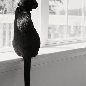
1.


What I like is the colors, what I don't like is the branchs hanging right over top of her head lol. I mean I like i for the framing but maybe its too much.
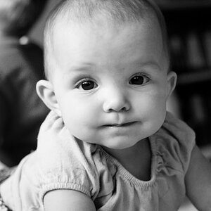

2.


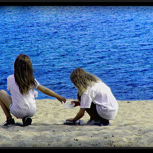
I love the way they all look so genuine here.

3.


4.


My niggle on this is the branch lower camera corner right which I will probably get rid of.


5.


Again some might hate the branches but I love natural framing. I might be a shade dark too.


Anyways, just thought I would show some of my latest stuff and see what kind of C&C it gets and yes I realize I added more than three lol.
 
I love them. #3 is my favorite! Great job!
 
Nice photos! I really like #5, the framing is really nice
 
Excellent work Dee.

The overall thing that I think, could be reconsidered, is that in most/all of these photos, the subjects only take up a small portion of the image. Going off of just these images, I'd suggest cropping/shooting closer and use portrait orientation when shooting subjects/groups that are taller than they are wide.

But I'm sure these aren't the only options you offer to them and these would still be OK when printed at larger sizes.
 
I like the use of horizontal orientation in these. They're are a good example of a technique a much more accomplished photographer once told me. He said that portrait (vertical) orientation is a very formal way to take a picture and generally the only story it tells is "this is my subject" which is not a bad thing at all, but it just sort of is what it is. In contrast landscape orientation like these photos tends to tell a whole story. They really say something in their composition. Each of these shots "COULD" be cropped to the subject in a tight portrait orientation & be textbook portraits that would be nice but in my opinion they'd sacrifice a lot to do that. The thing I like about these is that they each tell a story. Especially #3, that screams young love to me.
 
Excellent work Dee.

The overall thing that I think, could be reconsidered, is that in most/all of these photos, the subjects only take up a small portion of the image. Going off of just these images, I'd suggest cropping/shooting closer and use portrait orientation when shooting subjects/groups that are taller than they are wide.

But I'm sure these aren't the only options you offer to them and these would still be OK when printed at larger sizes.

Your spot on there Mike, I tend to shoot a lot of horizontal images and then crop or shoot a vertical as well to give them the option of both on ones that I really like.

Here is the vertical of the first shot and I think the environmental/wide shot is nicer.

 
Last edited:
#3 and #5 are my favorite out of the 5 of them.

#1 I find they are lost in the frame. Should have been a tighter shot IMO.
#2 This one is nice, as you've got nice separation from the background, but I think it lacks a bit of punch. (easy to fix in post) Also you've chopped them off right at the waist. General thoughts are to not cut people at their pivot points.
#3 Nice framing and I don't mind the extra space in this one. The scene add nicely to the image.
#4 It's OK, but again I think it lacks punch. Maybe a B&W for this one? Your close to the hips again, but I think this is OK in this case, your just low enough.
#5 Nice use of the natural elements to frame them. This one you probably could have been tighter, as the trees on the left don't add anything to the image.

Overall nicely done.

1. I posted an alternate crop/view of the first. I like the first because of the natural flare and all the color of the surrounding leaves. The oldest sister wanted to do a session to make a very large picture for her parents for Christmas so we did a variety of locations and what not. You can see more of the set here .

2. I could probably brighten it a tad yes.
3. Thanks!
4. I tried a black and white but the color version was warmer which I thought gave more to the image of a couple. shrug I could be wrong.
5. I do have this in a vertical as well. I should dig that out.

Thanks for taking the time for your feedback, appreciate it.
 

Most reactions

New Topics

Back
Top