What's new

Tight face shot

Thayli

No longer a newbie, moving up!
Joined
Jun 13, 2012
Messages
146
Reaction score
48
Location
United States
Can others edit my Photos
Photos OK to edit
$1.webp

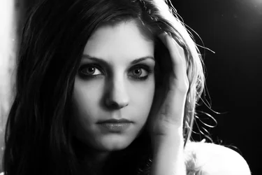
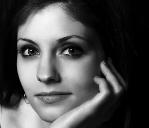
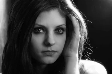
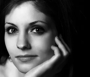
You ever have a shot which you don't like, but everyone else does? This is my most recent. (Its not a recent shot, but it was found on my computer by a certain unscrupulous, nosy and know-no-boundaries person who then let all her friends see it). Everyone loves it but me. It wouldn't bother me normally, however it is being compared to a similar (and in my opinion far superior) tight face shot which happens to be one of my favorite images I have:
$2.webp

So, C&C welcome and appreciated as usual, but I'm really trying to figure if my idea of what is good is so far removed from general consensus. And also if I should care that much. :)
 
I like the lower one; the upper one, to be honest looks like it was a lighting trial shot from that session, not a keeper. I think what you may be experiencing is the difference between a photographer's opinion (your own) and a non-photographer's opinion (their's). I get a fair amount of this myself. People ask why I binned a particular shot, and point out blown highlights, cropped fingers, or whatever, and they invariably say, but it's such a great shot...
 
I'm learning and this is a good way to do it, so I'll let you know what I think FWIW. So, you know, grain of salt.

Your unscrupulous friend is gorgeous, but you already knew that!

I like the skin texture in #2 better than #1, but with the tight crop, the hand position in #1 works better for me, and the separation of the hair from the background adds depth in #1, but the bright shoulder is a little distracting. With #2 it isn't clear to me where her body is positioned and I find it a little unsettling. Overall though, I'd pick #2 as my favorite because of the skin texture and something about the expression that I can't put my finger on.
 
#2 is nice but I'm unsure about the hair not separating from the background.
 
With the obvious flaws mentioned, I really like #1. I would like #2 better if she was about 10 pixels to the right.
 
I like the lower one; the upper one, to be honest looks like it was a lighting trial shot from that session, not a keeper. I think what you may be experiencing is the difference between a photographer's opinion (your own) and a non-photographer's opinion (their's). I get a fair amount of this myself. People ask why I binned a particular shot, and point out blown highlights, cropped fingers, or whatever, and they invariably say, but it's such a great shot...

I think this is pretty much bang on. And I also agree with the lighting trial.

I like the skin texture in #2 better than #1, but with the tight crop, the hand position in #1 works better for me, and the separation of the hair from the background adds depth in #1, but the bright shoulder is a little distracting. With #2 it isn't clear to me where her body is positioned and I find it a little unsettling. Overall though, I'd pick #2 as my favorite because of the skin texture and something about the expression that I can't put my finger on.

I should probably point out that #2 has PP done individualy, while #1 was part of a batch process and never got any solo attention. I usually batch all my shots first thing, then do my selection of keepers, and then start from scratch again on the ones I want to keep. #1 never made it past selection, so the PP is very 'general'.

#2 is nice but I'm unsure about the hair not separating from the background.

It was my big thing at the time lol. I have about a months worth of shots that all had the hair and clothing merge with the background. The following month I was onto blown out backgrounds and rim lighting. Even now however I still tend to like the face to be the only definable edge, and will usually try to include a few shots like this every session. The majority don't like this however and its been mentioned to me several times. I still do it though. :er:


With the obvious flaws mentioned, I really like #1. I would like #2 better if she was about 10 pixels to the right.

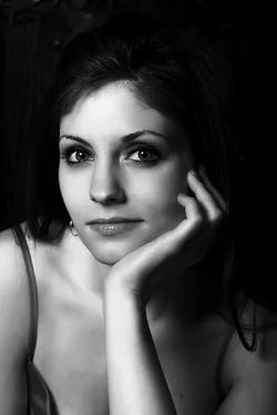
You mean like this?
$3.webp
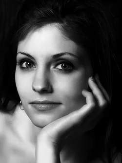
There is actually quite a lot of room to play with as this was a really small crop of a much larger original. I was thinking of Breakfast of Tiffanys at the time, but I couldn't get a way of showing her arm without it looking as if it belonged to someone else. (Also didn't help that unscrupulous here had never heard of Breakfast at Tiffanys). So I cropped it right down to the chin, and immediatly decided it was one of my favs. The complete original is below.
$4.webp

I dunno, I thought you all here would be much more critical of #1 and back me up more lol. I may have to run #1 through photoshop (if i can find RAW) to see hyow it comes out.
 
I like no.2 but in a portrait format, like this:
 

Attachments

  • $4.webp
    $4.webp
    99.2 KB · Views: 87
I like no.2 but in a portrait format, like this:

I like the extra space, but whenever I try that crop (or thereabouts) I get this horrible gnawing that says its not her hand! (Remember the Naked Gun scene when she trys to slap him at the restraunt table, but he catches her hand, then she trys with her other hand and he catches that hand as well, then a third hand comes up from under the table and smacks him? Well ive got the same expression as he does at that moment). I guess i'm probably just fixated on it now.

I also put #1 back through photoshop, but it got worse as opposed to better:
$5.webp

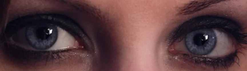
So I am now officially done with it, and am blowing raspberries at those that may prefer it. Cos thats how I roll. On a plus note however, when I was doing PP I noticed a nice reflection of myself in the eyes, and Ive decided the next time I get my camera out Im going to try and do a self-portrait in her eyes. (Or if I can find another suitable female, maybe shoot female #2 through females #1s eyes). So as much as I hate the pic it did give me an idea.
$6.webp
 
It would be hard to make a bad photo of her - she is beautiful.

I'm very much a non-professional so I just see something and I like it or don't like it. I really like tight face shots. And I like both of these. But honestly, #1 is my favorite. I like the harsh lighting, the contrast, the pose. Sorry! :)
 
i dont know what it is but i tend to see the skin looking processing kind of blurry especially in number one. #2 is fine but #1's skin looks like you used a blur tool and just looks, well, not right. otherwise nice shots
 
i dont know what it is but i tend to see the skin looking processing kind of blurry especially in number one. #2 is fine but #1's skin looks like you used a blur tool and just looks, well, not right. otherwise nice shots
I should probably point out that #2 has PP done individualy, while #1 was part of a batch process and never got any solo attention. I usually batch all my shots first thing, then do my selection of keepers, and then start from scratch again on the ones I want to keep. #1 never made it past selection, so the PP is very 'general'.

Its probably that you're seeing.

It would be hard to make a bad photo of her - she is beautiful.

I'm very much a non-professional so I just see something and I like it or don't like it. I really like tight face shots. And I like both of these. But honestly, #1 is my favorite. I like the harsh lighting, the contrast, the pose. Sorry! :)

:-P

(Its supposed to be a raspberry lol).
 
I like no.2 but in a portrait format, like this:

I like the extra space, but whenever I try that crop (or thereabouts) I get this horrible gnawing that says its not her hand! (Remember the Naked Gun scene when she trys to slap him at the restraunt table, but he catches her hand, then she trys with her other hand and he catches that hand as well, then a third hand comes up from under the table and smacks him? Well ive got the same expression as he does at that moment). I guess i'm probably just fixated on it now.

Classic scene that.

Interesting though, It still works for me but I see what you mean....or does it work?....GAH! now you've said that it isn't her hand there, you've wrecked it for me. :lol:
 
I like the lower one; the upper one, to be honest looks like it was a lighting trial shot from that session, not a keeper. I think what you may be experiencing is the difference between a photographer's opinion (your own) and a non-photographer's opinion (their's). I get a fair amount of this myself. People ask why I binned a particular shot, and point out blown highlights, cropped fingers, or whatever, and they invariably say, but it's such a great shot...

It's an interesting one as to who is right tho; different people will see different things. To a photographer, techincal issues jump out, and it can be hard to see past them, but so someone that doesn't see these it might be a great image, or maybe they see faults you don't see because you don't see past the is tecnical perfection of another shot.

My wife will hate shots I love and visa-versa, and I'm quite liberal in my approch to being technically correct (ie it doesn't bother me as much as most). Having said that, I get contantly ditracted by seeing fringing, pentagonal bokeh highlights and all sorts of other technical rubbish while watching TV. I wish I could just turn off that part of my brain when I don't need it -- photography has permenantly damaged me!!
lol.gif


I think there does have to be a large dose of "the customer is always right". Question is, when it's a photo of your wife, taken for your own enjoyment, are you the customer or is she? :-P

Aside from that, I'm going to be awkward and say I actually prefer #1. Obviously there are a couple of technical issues with it; the blown highlight of her shoulder, and the darkness of the shadow her nose has made being the most obvious two as I look at it (not counting the PP obviously), but to me it's the more interesting image, even it it's less technically correct, and that's more important to me.

I often get my wife to help me with photo selection (regardless of whether it's photos of her or not), just to get a completely different point of view.

There really is no right or wrong when it comes to preferences though ;)
 
Last edited:
I think there does have to be a large dose of "the customer is always right". Question is, when it's a photo of your wife, taken for your own enjoyment, are you the customer or is she? :-P

Aside from that, I'm going to be awkward and say I actually prefer #1. Obviously there are a couple of technical issues with it; the blown highlight of her shoulder, and the darkness of the shadow her nose has made being the most obvious two as I look at it (not counting the PP obviously), but to me it's the more interesting image, even it it's less technically correct, and that's more important to me.

Yeah, but ive been having a running battle with my wife for the last 6 months about ownership of photos, (mainly that I don't care who the subject is, they're mine, all mine) and to allow her to have an opinion (the suffragettes have a lot to answer for, I tell you - Im kidding!) at this stage would open the flood gates to all sorts of nonsense.

Not only that though, but while #1 may be more interesting, there are just too many things wrong with it to me for it ever to be considered anything other than-as tirediron put it-lighting practice. At best then, its a pose/setup I should return to and do properly, not 'put up with' a bad shot thats kinda interesting.

Dammit Ralph, if my wife see's you're post I'm not going to be happy. And giving her ideas about 'the customer is always right?" Well that's just crazy talk and I won't have it.

Seriously people, all you had to do was say #1 sucked badly and #2 was acceptable. One job people, one job.

:lol:
 

Create an account or login to comment

You must be a member in order to leave a comment

Create account

Create an account on our community. It's easy!

Log in

Already have an account? Log in here.

New Topics

Back
Top Bottom