
Bitter Jeweler
Been spending a lot of time on here!
- Joined
- Apr 27, 2009
- Messages
- 12,983
- Reaction score
- 4,993
- Location
- Cleveland, Ohio
- Can others edit my Photos
- Photos OK to edit
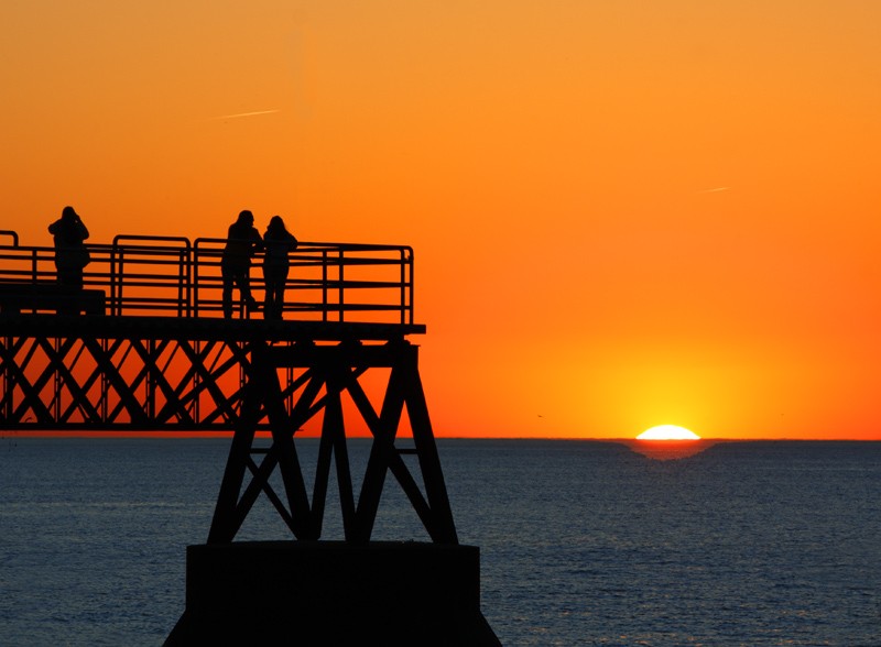
1). Obligatory Sunset.
Shutter: 1/100, Aperture: F/11, ISO: 100, Lens: EF-S55-250mm f/4-5.6 IS (Handheld)
2). Here is the Steeple.
I love church steeples. I have taken a lot of pictures of them, and it is very hard to keep them interesting if you are looking at them as a series. I wanted the focal point to be the little "birdhouse" like thing in the middle, and I hope the crop keeps the viewer curious about the rest steeple/church. Success?

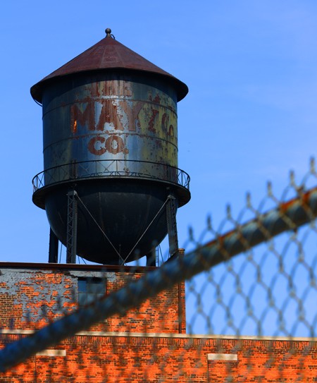
3). Water Tower.
Here is another subject matter that I find interesting, but am having a hard time with interesting composition. I fear, like the steeples, all my pictures of water towers will just look the same. Are you bothered by the building being on a slant?
Thanks for looking, and for your comments.
David
Shutter: 1/100, Aperture: F/11, ISO: 100, Lens: EF-S55-250mm f/4-5.6 IS (Handheld)
2). Here is the Steeple.
I love church steeples. I have taken a lot of pictures of them, and it is very hard to keep them interesting if you are looking at them as a series. I wanted the focal point to be the little "birdhouse" like thing in the middle, and I hope the crop keeps the viewer curious about the rest steeple/church. Success?
3). Water Tower.
Here is another subject matter that I find interesting, but am having a hard time with interesting composition. I fear, like the steeples, all my pictures of water towers will just look the same. Are you bothered by the building being on a slant?
Thanks for looking, and for your comments.
David
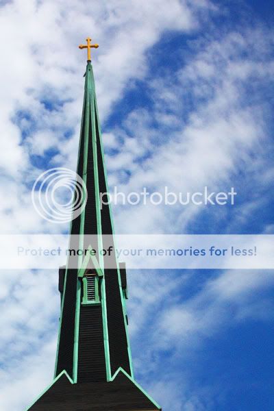
") , which is why I cropped it, with specific intent. For years I have wanted to make a book of Steeples. There hundreds of them here in Cleveland. So to assemble a whole series of steeples, I am trying to find different and unique ways of presenting them. I have found with a lot of them, there is nothing to frame them with (trees).
, which is why I cropped it, with specific intent. For years I have wanted to make a book of Steeples. There hundreds of them here in Cleveland. So to assemble a whole series of steeples, I am trying to find different and unique ways of presenting them. I have found with a lot of them, there is nothing to frame them with (trees). 

![[No title]](/data/xfmg/thumbnail/38/38262-10a9668da9a2b36a92cddde57caf87bc.jpg?1619738547)


![[No title]](/data/xfmg/thumbnail/30/30886-4d4f2b370f36c175a23901cc8689aea4.jpg?1619734498)


![[No title]](/data/xfmg/thumbnail/30/30885-2764c7a15a288ed06f3903d3a2756832.jpg?1619734497)