Today :)

paigew

Been spending a lot of time on here!
Joined
Nov 15, 2011
Messages
3,880
Reaction score
1,827
Location
Texas (Hill Country)
Website
www.paigewilks.com
Can others edit my Photos
Photos NOT OK to edit
Here are some photos from today. c&c please

a friends kid
f2.2 iso 100 ss 1/200
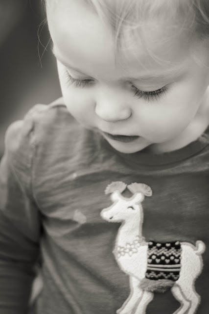
IMG_3276.jpg


my baby boy
f2.5 iso 100 ss1/320

IMG_3297.jpg by paige_w, on Flickr

fixed :)
 
Last edited:
C&C per req:

1. A nice shot, but rather too closely cropped I think, and could use a little more DoF (In future if the EXIF data is stripped off by your hosting 'site or processing it would help greatly to append it to your post). I think too the conversion could use a little more contrast; as-is, it's rather too mid-tone rich I think.

2. Good skin tones; the whites look a little hot, but that's not a big deal. I would suggest again, leaving a little more room, and avoid having the subject quite so centred.

Just my $00.02 worth - your mileage may vary.

~John
 
Thanks John! I had the exif data posted but I went back and made it bolder so its easier to see :)

I will play around more with the contrast thanks for that tip. This is my 3rd and 4th edits using lightroom and I am loving it. I had to crop (#1) closeer because there was a playground slide on her left side. Though I could probably have done a larger crop. I will play around some with that too, thanks!

This photo (#2) is my favorite photo yet! I love the way it looks and though it looked great color, the b&w is my fave. Would you recommend haveing more dead space on one side of his body? How would you crop a shot like this off-centered? It was fairly close cropped to begin with but I did crop a lot of dead space off the bottom and top. Should I have maybe taken the photo in landscape orientation to allow more space? Thanks for your tips!
 
I prefer #1, exactly as-shown. it is cropped tightly...that's what I like about it....shows her eyelashes well, the whispy bangs, three stray hairs, and the llama- or alpaca-themed kid shirt...a very cute, close-in look at a toddler. Over 90% of the entire frame is devoted to the child!

The second one....ehhh I do not like it very much...her head looks too cramped, too close to the tippy-top edge of the frame, and the blown-out white background right at the top of the picture just ruins the shot for me. Strong, pure white "pulls" the eye and brain right to it. The second shot has too much of that deeply OOF foreground at the bottom, and not enough top space. The background is also a slight bit unsettling.
 
Thanks Derrel, yes, looking at it now I see what you mean about the backgound. I think it is the two un-even horizontal stripes in the center. It is throwing me off a bit now; especially since the right stripe is a bit darker. Thanks for that insite!
 

Most reactions

New Topics

Back
Top