What's new

Took a picture of one of the most intelligent people I've met in a long time.

dearlybeloved

No longer a newbie, moving up!
Joined
Dec 22, 2009
Messages
511
Reaction score
41
Location
Auburn, AL
Can others edit my Photos
Photos NOT OK to edit
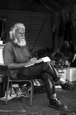
Met this guy today and we started talking and about 2 hours in I realized how intelligent and articulate he is. I was hoping to get some feed back on the composition and lighting and whether or not I have captured what I was going for and able to present it in a way that shows others how I view the man.

Let me know what you think and any tips to make this a better quality photo.

Thanks in advance.


EDIT: Album on IMGUR http://imgur.com/a/Xyw8R#0
$FIG1N.webp
 
Last edited:
Nice lighting on his lower legs and feet
 
Nice lighting on his lower legs and feet
That's all, what you noticed ? Hmm...
Me, I don't know, what to think. His face is for sure interesting and would call for close up portrait. The picture you presented is a your personal view but I don't think your feelings are well transmitted to us, viewers. (OK, at least to me, I can't speak for everybody.) You, I guess, wanted to include the pile of junk, suggesting some connection, but in my feeling it is a serious distraction, especially, that you moved the face of your subject away from strong points of the composition. (Not by much, but in this busy environment enough for the eyes to get lost.) Maybe with less DoF the picture would be more romantic, maybe a ultrawide would give more prominence to the man while still keeping background clear and sharp. Maybe he should look in camera and this way better connecting with the viewer.
 
Only having a bit of fun, go back with a reflecter and a friend and direct some light into his face with a bit more thought you could get a great shot
 
I think I have to agree, i have a few more shots of him and some that are close ups so ill work with a few of them when i get home and ill post a few more edits. Thanks for the feedback!
 
I think this is one of the few instances where a horizontal frame would have worked better than a vertical frame.
 
I think you need to make up your mind whether this is a portrait (in which case, get in closer, anywhere from a headshot to a 3/4 length, but make it a picture of HIM) or whether it's an environmental portrait (in which case open the frame up, more depth of field, so we can see that environment).

Apart from this, this photograph is excellent. As a placement of forms, I think he's well positioned in the frame. He's very photogenic. Decent tones, but I would try to bring out the middle greys a bit more, this feels a little heavy on the blacks and whites to me (but that's just my taste speaking, there).

I feel like you've done a better job with this fellow than a lot of similar photos. I've bitched on these forums recently about photos of homeless people (not that this guy is homeless, I can't tell -- but this photo is certainly at risk of being a lazy photo of "interesting eccentric guy"), and how they tend to be lazy and easy. This isn't so lazy or easy, it feels to me like you've done some work to get at the man a bit. The pad of paper in his hand, the little bits of environment, the way you've handled the tones to bring out the interest in his skin and the contrast between his white hair and leathered skin, and so on.
 
I think this is one of the few instances where a horizontal frame would have worked better than a vertical frame.

After reading this, then going to look at the image again, I whole heartily agree.
 
Amolitor! you came through and have given me a lot to think about. haha. Unfortunately, the man is homeless and was wanting to keep it with a rugges look. When i get home im going to play with it some more and try to bring out the mid greys and check out some of the other photos i have of him and present you guys with a new edit. thanks for everyones feedback, its all appreciated and taken in high consideration
 
regardless of whether or not he's homeless, quite obviously his homelessness wasn't the point of the photo, which I think is the key from keeping these sorts of photos from being tasteless exploitation to appreciation for another human as a human.
 
Here are the edits i said i would post in comparison to the original. Feel free to leave feedback on any of the other edits, I'd love to hear some insight and opinions.

Thanks.


http://imgur.com/a/Xyw8R#0
 
I like really no.7, color somehow does not work for me, maybe is softening the impression.
 

Create an account or login to comment

You must be a member in order to leave a comment

Create account

Create an account on our community. It's easy!

Log in

Already have an account? Log in here.

Back
Top Bottom