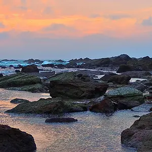
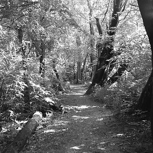
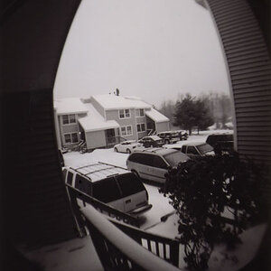
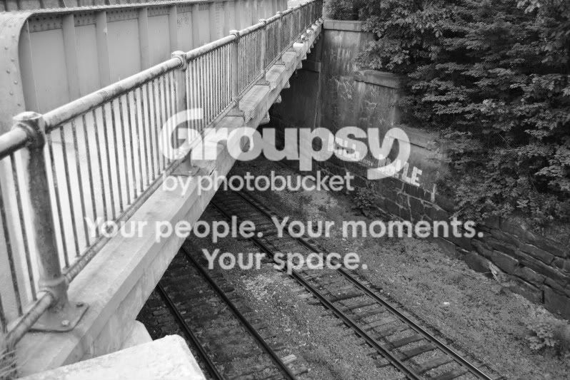
I love #2. Great image, but it could use some more contrast, it's primarily middle-gray.
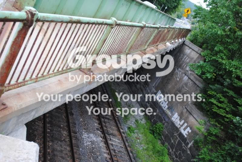
The diagonal lines are what make this good, for me. I like the crossing paths, the bridge being light and the tracks being dark.
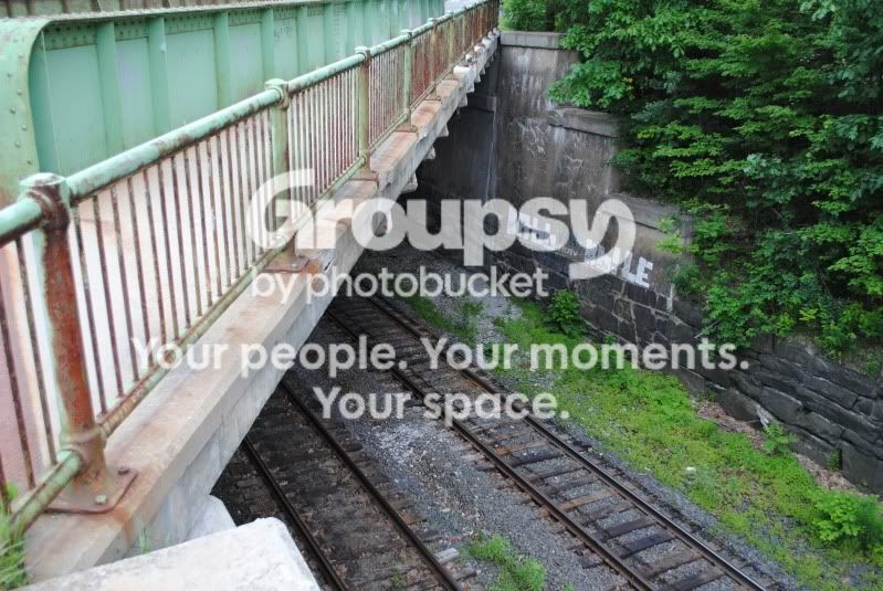
I took the liberty of taking the color original and converting it to black and white green filter with Silver Effex and then played with the burn tool. I tried not to obliterate the detail..
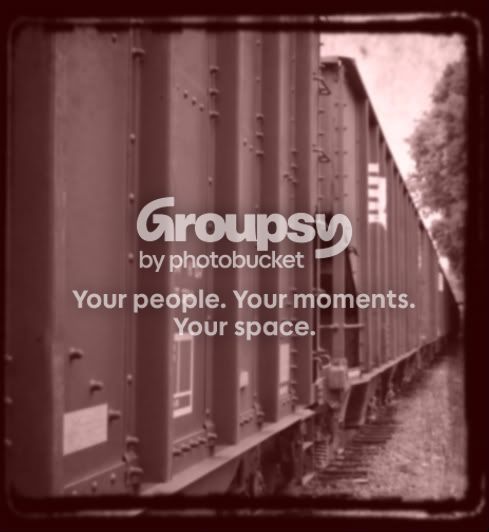
im not to sure why it converted to become so blurry. my editing skills are very poor have never really tired it before
rez that came out pretty sweet did you do all that in photoshop?
im not to sure why it converted to become so blurry. my editing skills are very poor have never really tired it before
rez that came out pretty sweet did you do all that in photoshop?
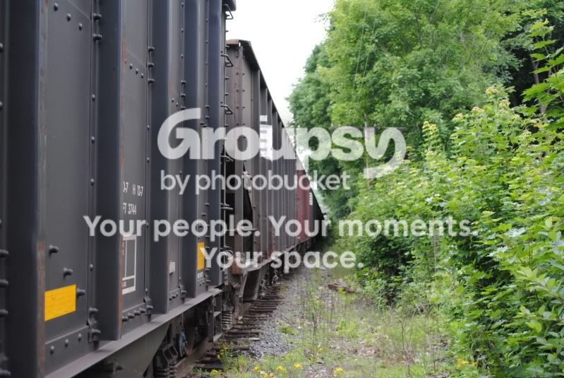
Personally I like the first one more. I'll remind you though that I'm not very experienced with a camera or what looks good in terms of composition, just learning as I go.
I like the first one BW and Rez's editing on it. (I REALLY want to get Nik SliverEfex). Generally with my editing of BW at a minimum I add contrast to the image, sometimes quite a bit to (as was mentioned) take it away from the middle gray look.



 I really like the shot.