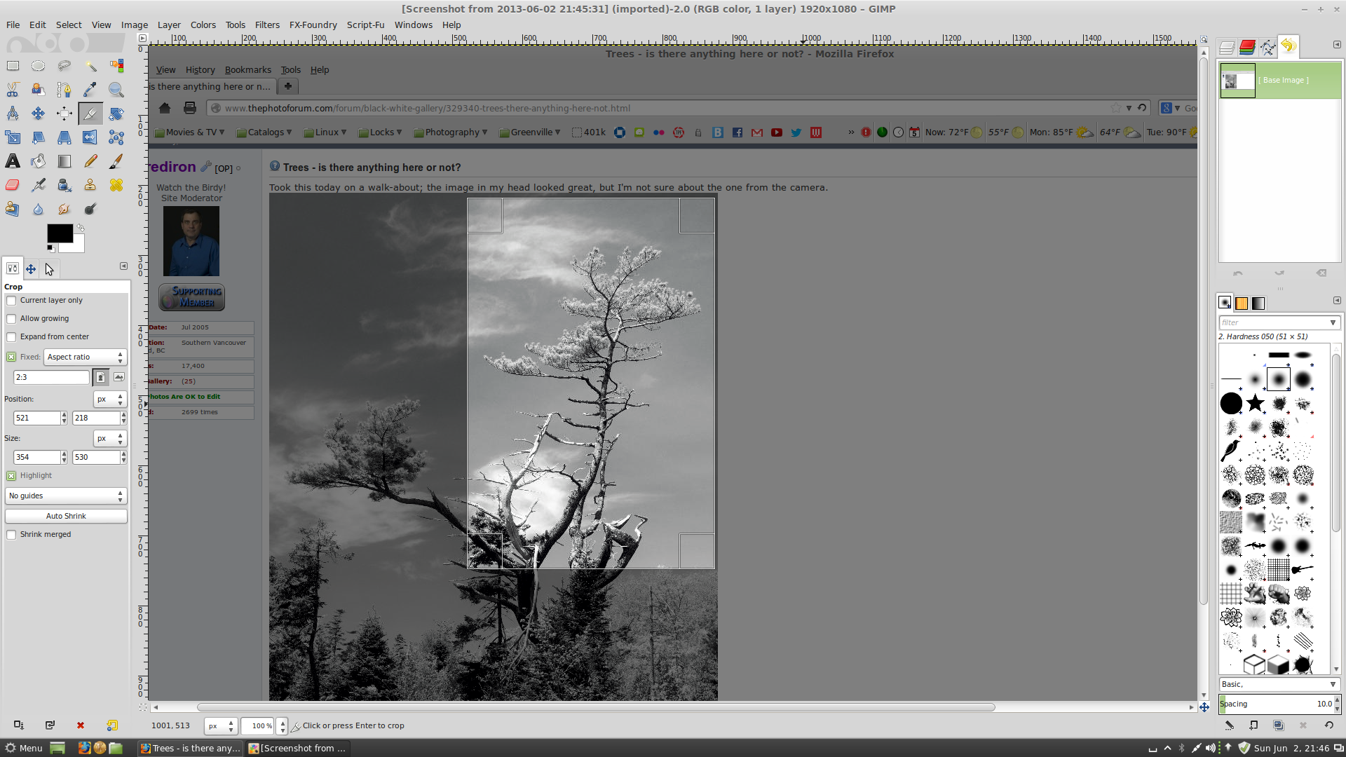
In the color version, I find the material at the bottom of the frame too busy and bright, it doesn't give weight to the bottom. The color one works for me if you crop a more or less square image off the top, eliminating all the stuff on the bottom.
In the black and white the darker masses are not quite there for me, they feel a bit thin and unsupported. I would probably try burning large areas toward the bottom to create a better visual balance, to see if it can be done without destroying the sense of the light. I suspect not, I think when it gets visually balanced, it will look fake and bad.
The clouds are also almost but not quite there. There's a lovely echo of the tree's shapes in the clouds, but I think there's too much overlap or something.
If it were me, and I wanted to really make something of it, I'd go back earlier or later in the day and try for more darkness lover down, and shoot for half an hour or so with whatever clouds came by to try to get a serendipitous arrangement of clouds. But then, I love me some inky pools of darkness, so that's probably just my biases talking.





![[No title]](/data/xfmg/thumbnail/37/37111-64f64f2c8371420041bf39244ff12117.jpg?1734169830)
![[No title]](/data/xfmg/thumbnail/37/37115-e2d49d984453c62a2a20cf741e3d6679.jpg?1734169831)