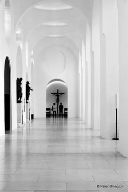
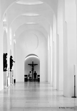
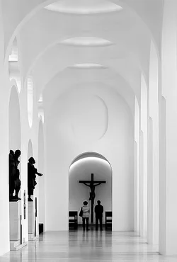
I like the second one because it seems to bring the viewer in a little closer, more into the scene.
I wasn't sure if I liked the sign included or not; it isn't particularly interesting itself but yet it seems to balance the statues and the people. I don't think it's really a distraction, it seems part of the scene. I think I like it in better than out being in B&W where I think you notice the pattern of the shapes.
Removing the grain makes it seem more stark and artificial, I'd leave well enough alone.








![[No title]](/data/xfmg/thumbnail/35/35966-4f59fb71a71adfe775ae568f8c534699.jpg?1734167835)

![[No title]](/data/xfmg/thumbnail/38/38722-8003d9d84f1c7164b5c8f2b884c2e428.jpg?1734172598)