Triptych Cycle C&C (BESP Project 3)

fast eddie

TPF Noob!
Joined
Jan 6, 2010
Messages
99
Reaction score
1
Location
Seattle
Can others edit my Photos
Photos OK to edit
This Week's project is to make a Triptych (an image in three parts).

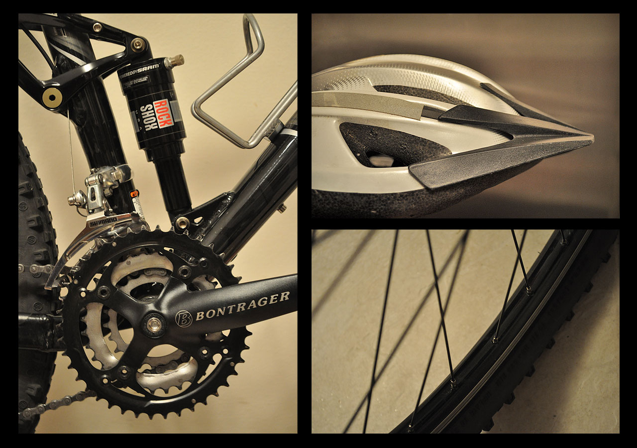
I needed to take 3 images of a subject and combine them into triptych form. paying attention to composition, and arranging them in a pleasing manner. Hinting at the idea that three images together, as a whole will also have some loose compositional relationship.

Please critique based on the project outline and include any suggestions or comments you have.

Peace
Fast Eddie

Triptych Cycle

4444636777_bd200b86ca_o.jpg
 
Nice images, I could see this one hanging on the wall in a bike shop. The border is a little too thick for my taste. Also, and perhaps it's just me, but I feel like I'm being lead toward the extreme edges of the frame a bit too much.... the edge of the tire on the left and the helmet pointing off to the right both entice my eyes outside of the frame. Finally, the red in the decal throws off the entire set for me... I think it draws a little too much weight.

Nice job!
 
This looks nice. I like the helmet shot. It really gives a feel of a lot of movement. I agree with ^ that the red is distracting.

But where is the mud? :D Its too clean for a mountain bike.

-Gian
 
I like it.

I like the composition of the 3 photos because is giving more emphasis to the bike (left shot). I'm still trying to figure out the story behind them, for some reason it looked to me more like an ad where you want to show a cool product; also especially because everything look too clean for a mountain bike ;-)

I find balance in the composition, I like how you cut the objects to show only part of them but still showing them.
 
Technically this is a collage rather than a triptych.

I sorta have problems with the centered composition of the divisions. I don't find any relationship to the images beyond straight forward bike. There are so many ways the three images of a triptych can be tied together to privide greater viewer interest. This feels like a product shot for a brochure. As mentioned, I think the helmet (didn't know what it was, myself) could point into the frame rather than out of it. I would have rather seen the background of that panel be the same color as the other two, or all of them to be different. In the other two shots you have come in close and really selected out a small partion of the subject. think the same could have been done with the helmet. and it's color matches closely to the other backgrounds.

I also agree about the red sticker issue. The color could be used as a tool to help lead the eye around if there were some red in the other panels. Everything has a similar tonal range, and is quite pleasant, and then there is the red.

Nice clear crisp shots. I really like the image of the wheel, nice perspective, and composition.

My 2 cents.
 
Thanks for the feedback all.

Yes, now that I look at the red it stands out way too much. I started working it as a black and white, but liked the subtle warmth of the cream color.

Bitter, I guess I missed the mark on the Triptych - lesson learned. Although the images do have a relationship - I saw a lot of triangles in the bike and helmet in the negative and positive spaces. and tried to call them out. Obviously they are too subtle or not as interesting to others as they are to me. Next time I will try to tell more of a story that an idea. My designer's mind probably works differently than most of yours - that's part of the reason I'm here, and can learn so much from you guys - and gals.


Peace
Fast Eddie
 
At first glance i would say ....yay, he got it!
Then i look back and wonder whats interesting about it....The shots are nice, and they all fit the same catagory, but just not interesting to me. The helmet kind of sticks out to me because its not part of the bike like the other two shots. I wonder if maybe you had the handle bars in that shot...Or if you had the first shot of the chain area, and the one of the helmet, and maybe the other one of something else that went with it, but wasnt physically part of the bike....?
I really dont know enough about triptych to really know what would work and what wouldnt. So my comments are more based on what i would have done differently.
I almost cant concentrate on the other two images because im so drawn to the helmet....
I actually dont mind the red in the first image. Its the largest and in my opinion needs the red to take interest off the shape of the helmet and the shadow of the tire. Each one has something to sort of catch your attention...But that helmet just isnt working for me still...
I do like the colors....maybe if the helmet shot wasnt as dark in the back. I see that they are all different even though two are almost the same shade...I like that.
 
Nice job.

I like how you had both curved and intersecting lines in all of the images. The helmet shot looks like it's moving! I also like the way you laid out your images. I find all 3 images interesting on their own, and they compliment each other nicely in triptych form.
 

Most reactions

New Topics

Back
Top