What's new

Trying the logo thing again...

JeffieLove

No longer a newbie, moving up!
Joined
Feb 8, 2010
Messages
1,601
Reaction score
15
Location
Elkton, MD
Can others edit my Photos
Photos OK to edit
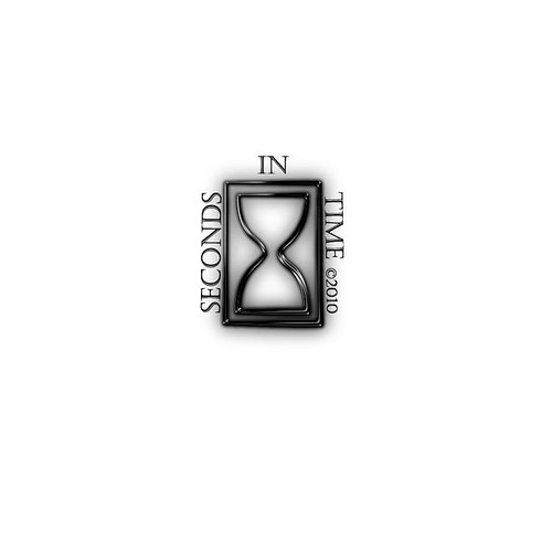
I am trying a more logo type thing instead of the banner style watermark that I've been using... Would like opinions on these as logos. They will also be used as my watermark on my images. I will be putting it in the lower right hand corner and lowering the opacity to about 35% so it will look more like an embossed watermark kinda thing...

Let me know what you think about them or what I can change :) And most importantly, which one you think is the best as of right now :)

Thanks in advance!

1.
4713441236_1a1b3a3aee.jpg


2.
4712803011_aa116677e9.jpg


3.
4713441422_bd9354a267.jpg
 
Last edited:
I like the first one the best.
 
Like most people (I think) I don't like seeing these very much. Based on that, I like the 3rd one the most. It's definitely the least distracting of the 3.

EDIT: I do like the font a lot.
 
Yeah... I'm obsessed with the font :) LOL

It suits my "traditional" style, but also gives it that little bit of a pique of interest :)
 
Seriously? You can't decide on your own logo? I too am sick of these kinds of threads and peoples inability to make the most mundane decisions without help. Problem solved by not clicking into your threads anymore I suppose.
 
Nate, I was actually kind of looking for feedback on them as well. Not necessarily someone to just tell me which is the best one..

But whatever... Didn't know it was going to be any kind of huge issue to ask for suggestions.
 
Nate, I was actually kind of looking for feedback on them as well. Not necessarily someone to just tell me which is the best one..

But whatever... Didn't know it was going to be any kind of huge issue to ask for suggestions.....for the 14th time

.
 
and if I was to change anything, I would just change the font. I think a bold, simple font would go better with that hourglass...I'm not a huge fan of the curly text.
 
Nate. This is only the second time I've posted a thread about a watermark or logo and this is a completely different "style" than what the first was.

Up until now I actually thought you were one of the cool helpful kind of people but apprently I was wrong.
 
Last edited:
You are mixing elemental styles. They don't go well together. Drop the *glow* on the hourglass, and come up with a more "traditional" one to match your style, or the style of the font.

Also look at a *logo* as something that can stand alone, with no text, that's easily recognizable as a symbol of your business or work.


Curious, how do you define your style as traditional?


I forgot to add, you're text is crowding the hourglass. Give it some breathing room.
 
Last edited:
4713712614_0d995cfc3e.jpg


any better?
 
The hourglass was a stock image so I'm not sure if I can get rid of the glow without ruining it... I suck at "fine tuning" in photoshop... I can do the basics for now... that's about it...

As far as the traditional thing goes, I just feel like the style of photography that I shoot for with people that I have done so far has been just... traditional lol... nothing really "out there" or super creative or different... Maybe "ordinary" would have been a better word to describe it?

I du no... It's almost 2 a.m. and my brain is not working all the way at this point...
 

Create an account or login to comment

You must be a member in order to leave a comment

Create account

Create an account on our community. It's easy!

Log in

Already have an account? Log in here.

Back
Top Bottom