Navigation
Install the app
How to install the app on iOS
Follow along with the video below to see how to install our site as a web app on your home screen.

Note: This feature currently requires accessing the site using the built-in Safari browser.
More options
You are using an out of date browser. It may not display this or other websites correctly.
You should upgrade or use an alternative browser.
You should upgrade or use an alternative browser.
Trying the logo thing again...
- Thread starter JeffieLove
- Start date
Arch
Damn You!
- Joined
- Jan 21, 2006
- Messages
- 8,487
- Reaction score
- 103
- Location
- locked in the attic
- Can others edit my Photos
- Photos NOT OK to edit
Well not to sound harsh, but as a graphic designer I can tell this isn't made by a designer... instantly.
The style is confusing, the drop shadow doesn't help the shape (also not good for print production) and the typography, especially in the last, doesn't work.
Also be aware that with most stock images, you are not permitted to use it as a company identity. A few stock companies have started to make sections for logo shapes that can be purchased for this purpose, but the majority don't and can bring you a legal battle in future if your unlucky. Just so you know.
Having said all of this though, if you still want to go ahead with it... it isn't terrible, and is fine for someone just starting out, it just isn't professional looking.
Bitter Jeweler
Been spending a lot of time on here!
- Joined
- Apr 27, 2009
- Messages
- 12,983
- Reaction score
- 4,991
- Location
- Cleveland, Ohio
- Can others edit my Photos
- Photos OK to edit
I too am sick of these kinds of threads and peoples inability to make the most mundane decisions without help.
You mean like the "what camera I should get", "what lens I should get next", "What SD card should I get", "which tripod is better", "which camera strap should I get"?
BuS_RiDeR
No longer a newbie, moving up!
- Joined
- Oct 29, 2009
- Messages
- 2,355
- Reaction score
- 83
- Location
- Riverview, New Brunswick, Canada.
- Website
- mdlphotography.blogspot.com
- Can others edit my Photos
- Photos OK to edit
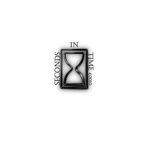
any better?
I like this.
SwissJ
TPF Noob!
- Joined
- Mar 29, 2010
- Messages
- 243
- Reaction score
- 1
- Location
- Brooklyn, NY
- Can others edit my Photos
- Photos OK to edit
I like your old-style banner better. None of these work for me yet, cause they don't make visual sense.
Don't use a stock image. Come up with another kind of hourglass.
I DO like the glow because it looks like a brand, much like a cow is branded. I think you could use that concept to your advantage.
Good luck, whatever you decide.
Don't use a stock image. Come up with another kind of hourglass.
I DO like the glow because it looks like a brand, much like a cow is branded. I think you could use that concept to your advantage.
Good luck, whatever you decide.
JeffieLove
No longer a newbie, moving up!
- Joined
- Feb 8, 2010
- Messages
- 1,601
- Reaction score
- 15
- Location
- Elkton, MD
- Can others edit my Photos
- Photos OK to edit
Swiss, would it be better if you saw them on an image?
Most reactions
-
 428
428 -
 290
290 -
 285
285 -
 271
271 -
 221
221 -
 204
204 -
 185
185 -
 179
179 -
 167
167 -
 166
166 -
 148
148 -
 133
133 -
 120
120 -
 95
95 -
I
94
Similar threads
- Replies
- 22
- Views
- 3K
- Replies
- 13
- Views
- 380
- Replies
- 8
- Views
- 736


![[No title]](/data/xfmg/thumbnail/32/32005-d13a0bcc56327c42bd32dff4b0776658.jpg?1619735150)


![[No title]](/data/xfmg/thumbnail/36/36643-92fe0dd9e247722bfefe299cd8a549f5.jpg?1619737670)
