All in all, they are quite well done. In comparison with the pro work I see, you have done some things better, and made minor mistakes that are made by pros as well.
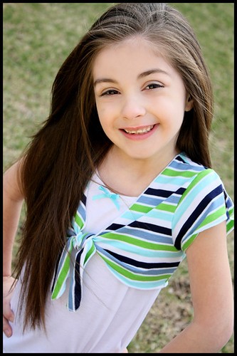
The eyes are the most important aspect of any portrait and aside from squinting in 2 and 8, they are well handled. It is great to see white in eyes indicating proper colour balance and no bloodshot problems. Detail in the hair is also important which is noticeable in your portraits.
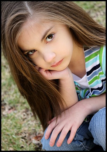
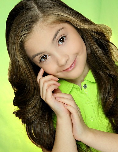
Skin colour is pretty good, although there are a few problems. In 4, 5, and 6 the front hand and part of the arm is pinkish and does not match the colour of the back hand and arm. Pros would selectively adjust the colour to match in postprocessing.
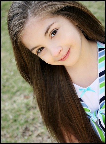
Framing is too tight on some shots and this applies to some pro work I see as well. The rule for portraits is Do not cut a model off at the joints and do not have important body parts too close to the edge of the frame, because the result is a visual distraction which draws the attention of the viewer away from the eyes of the model. So in 2, the elbows are too close to the edge of the frame and part of the left hand is cut off. In 5, the fingers are too close to the front edge of the frame and in several there should be more of the top or side of the head in the frame.
The top left of 1 has a bright visual distraction. I would suggest anyone stick to colour, who does not have consider experience with black and white. It is harder to work with and I seldom see quality work in black and white, even from many pros.
Good portraiture is attention to the smallest detail and having an eye for correcting the smallest problem before the shot. If that is your interest, then you have taken on quite a challenge, but these display some natural talent.
skieur


")


![[No title]](/data/xfmg/thumbnail/37/37634-504722605a418b398f3cd1dbabf936e5.jpg?1734170757)
![[No title]](/data/xfmg/thumbnail/41/41929-26c4134c150c4c6befd5f544a5223aaf.jpg?1734176286)
![[No title]](/data/xfmg/thumbnail/32/32805-61ca9a4fb87d37c0ef4f991ac1705e1f.jpg?1734162488)


![[No title]](/data/xfmg/thumbnail/39/39191-629bf2c0bb5afb4619be296cd91b9517.jpg?1734173067)
