What's new

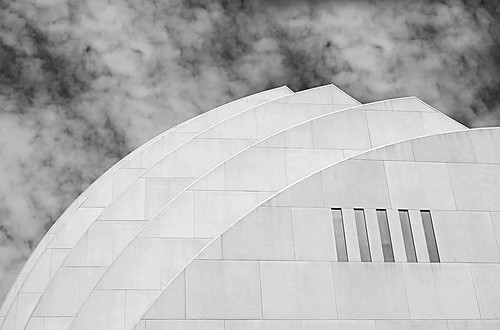
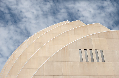
Two Takes

I like the color one better. Makes me more interested to see the rest and has a sense of depth where the B&W looks very flat to me.
 
This is the sort of image I normally prefer in B&W because it's really about the shapes and lines, not the color. However, the color works better for me here because there is a lot of color gradation that brings out details on those surfaces which are lost in the B&W.
 
Like em both but lean towards color. Nice and soft.
 
I prefer the color because the clouds just look better. In the B&W they look like smoke.
 
The color image works best as the clouds read better.
 
They both fit in their own respective scenarios, as the monotone image tells of a different story than the color. If I were going to use the monotone image, I would bump up the contrast a bit to bring out more of the detail. However, even though I love how the color one feels smooth, I'd be interested in seeing how it would look like in HDR. Great compositions by the way, not too much building and not too much sky, just right.
 
Thanks for the comments. I think I do agree with you all that I like the color a little better. It's still simple enough. But I keep getting drawn back to the b&w. You may be right, though, Ken. I may need to play just a little more to bring the texture back out in the building in the b&w.
 
Beautiful composition. I like both but incline toward the colour one. Maybe the building could be warmed up slightly, could contrast a little better with the sky.
 

Create an account or login to comment

You must be a member in order to leave a comment

Create account

Create an account on our community. It's easy!

Log in

Already have an account? Log in here.

Back
Top Bottom