What's new

Tyler Randall - PhotoShoots

TylerRandall

TPF Noob!
Joined
Nov 4, 2012
Messages
4
Reaction score
0
Location
Florida
Can others edit my Photos
Photos NOT OK to edit
Hi there (:

My name is Tyler and I am a photographer based out of South Florida. I thought I would go ahead and make a thread to share some of my portrait work. I am not sure if there are rules on this forum that prohibit me from making a thread like this, however I will continue to update this thread with shots until asked to stop.

Anyways, here is the first shot that I'd like to share with you (:

Go ahead and tell me what you think.
I am not asking for critique however it is accepted (;

Also for better quality, click here
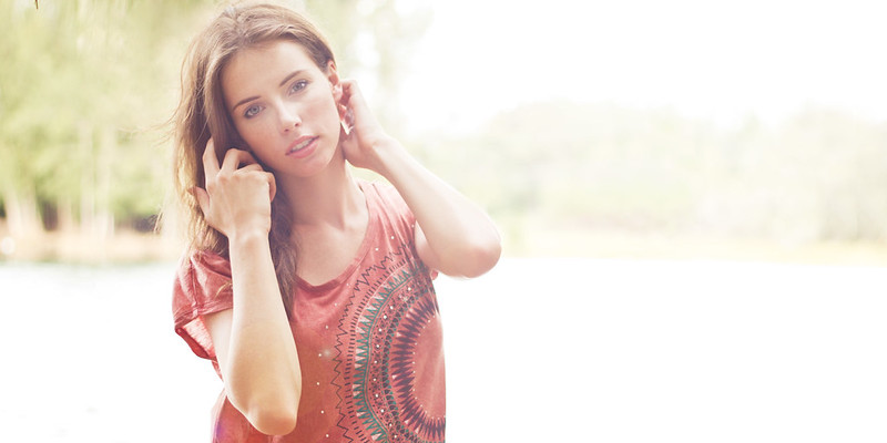
7533357954_b964d66cc2_c.jpg


Exif
Exposure - 1/250
Aperture - f/2.2
ISO - 400
Focal Length - 50 mm

 

Attachments

  • $7533357954_b964d66cc2_c.webp
    $7533357954_b964d66cc2_c.webp
    32.6 KB · Views: 125
Also, the image suffers from poor compositional form, lots of blown highlights... Including skin tones, sooooooo much dead space and an odd crop ratio.

Just my thoughts
 
I am truly a bit confused.
you say
Go ahead and tell me what you think.
I am not asking for critique however it is accepted (;

so I guess you want sort of general, chum-y stuff.

OK, I can do that.

Hey Tyler, I am Lew.
She is pretty.
I can't see her too well; I guess that means you have a style.
The image is wide.
The image is very wide.
I wish I had a style.

I suggest you add more pictures in their own thread so people will actually look.
We really need people with 'styles.'

Lew
 
Also, the image suffers from poor compositional form, lots of blown highlights... Including skin tones, sooooooo much dead space and an odd crop ratio.

Just my thoughts

SURPRISED to hear you make such observations about "poor compositional form", "dead space" and "odd crop ratio"... seems like that trip to FM must have made an impression...
 
I think it's safe to say you are happy with your own work and that is all that matters. If you are welcoming feedback then TPF will give it.

And give it they do. :)

I would like to say I like that she is very pretty woman who is comfortable in the shot. She isn't pushing which tends to be the case with portraits.
 
I guess it's possible that an art director told you to leave a lot of dead white space to the right and bottom left so that black type could go there?
 
Derrel said:
SURPRISED to hear you make such observations about "poor compositional form", "dead space" and "odd crop ratio"... seems like that trip to FM must have made an impression...

It seems like this type of shot would not be one that I would produce. Never once have I ever used a crop ratio that wasn't accessibly printable. Of course, you wouldn't have deduced that. Big surprise there.
 
OP as you can see we are just a tiny bit more discerning than the "Facebook Pros" that commented on this shot on your Facebook page (some of which were truly a hoot, especially those that appear when the photograph is moused-over). There are a lot of full-time true professional photographers on this site that you could learn a great deal from however I suspect you're going to have to open your mind a little bit. This is just plain not a very good shot.
 
She's pretty! I wish I have someone like her to work with on a regular basis. It's a nice shot and the current fad seems to be the washed out blown highlights looks. There's nothing wrong with it if you're into that. I do it once in a while too just to switch it up a bit. Her skin tone is a tad too yellow for my taste though. Also, head space is a bit tight in relative to dead space on the right. Obviously, the uninteresting dead space has already mentioned by others.
 
I personally really like this photo. I like the crop and the dead space and the blown out background... It works for me! She is gorgeous too!
 
The composition isn't working, for me at least. It's not quite a standard size, but not quite a pano either. The processing is a matter of taste I suppose; you could do with cropping the model tighter and in portrait orientation.
 
A little too much dead space, especially on the right side, but overall not too bad.
 

Create an account or login to comment

You must be a member in order to leave a comment

Create account

Create an account on our community. It's easy!

Log in

Already have an account? Log in here.

New Topics

Back
Top Bottom