I'm going to throw a lot of critique at you, but be aware that these are by no means terrible. You're clearly thinking it out in terms of the direction of light at least, and there aren't any giant brow shadows or anything like that, general concepts and locations are decent, etc. That said, lots of things could be improved:
Right photo:
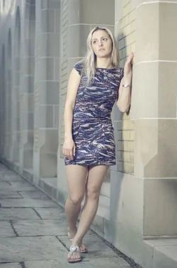
* Angling her shoulders and hips to the camera and popping the opposite knee would be more slimming.
* The light is VERY harsh. You would have benefitted from a much softer light source. Is this at night, it looks like (based on left image)? A bounced flash off of something might have been better for softness, or an assistant or stand with an umbrella or softbox.
* A wider aperture would help. This looks like it is shot at f/16 or something for no apparent reason.
* There is poor contrast separation between the model and the background. If the main light source here was added light by you, from a flash, then you should have used a faster shutter speed to darken the ambient in the background and allow better separation. If it was available light, then uh... I don't know. Supplement or find a better location.
* I probably would have angled her head slightly more to the right for more interesting modeling of her face. This is almost straight on.
* Her right arm is kind of floppy looking. Break the joints more, show the side of the right hand for a more elegant look perhaps. Mainly just doing something more interesting, though. Perhaps holding herself gently (swooping across toward opposite hip, seductive look), or a very slight hands-on-same-hip look (confident look), or maybe tucked behind her a little (bashful, innocent look)?
* White balance looks too cool, making her seem a little pale and sickly in skin tones to my eye.
* Model is too close to just being right in the middle of the shot, which is un-dynamic.
A good posing solution for many of these things at once would be to have her angled about 20 degrees from the wall with her shoulders, instead of 90, with her left arm holding the wall high enough for her hand to be a bit above her head, then her right arms also holding the wall just above chest height, and her head positioned so she is looking back over her shoulder, but not enough to pass the midline of the image. At about 7/8 or 3/4 to her left instead of right. This would make a pretty cool glamorous dramatic sort of Lichtenstein-esque pose with lots of mystery, and would take advantage of the prevailing light direction well (although the light would still be too harsh). It would also break all the joints, angle the hips and shoulders, and justify a full body shot more to the viewer.
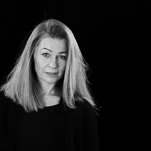
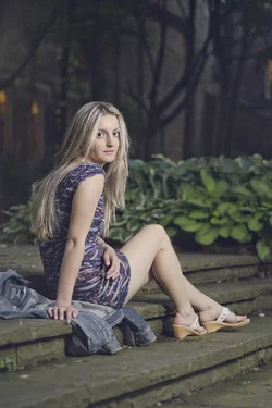
Left photo:
* Background is better blurred this time, but also more distracting with all the lines, especially ones intersecting her head.
* Also very very harsh light. What on earth is that? It looks too far to the side to be you holding a flash, but maybe that's it. Or a big bright street lamp? Whatever it is, it's pretty bad.
* Also cool white balance
* Her right arm is all wrong. Joints not bent (always try to bend any visible joints), and hand is facing straight on, making it look weird and paw-like. You want women's hands to be long and elegant, ideally from the side and draping or caressing something, etc. In this case, a simple fix would be bending the elbow to have the arm follow her spine more closely, then having the hand laying across the jacket to the right (also bending the wrist, therefore), with fingers just brushing the collar.
* Pose is otherwise good. Maybe could be a little less hunched over for a more confident look, but not bad. God compositional placement in frame.
* Noticeably very grainy. Since you should probably be adding light anyway to fix the terrible street lamp look, you could also get away then with a lower ISO and fix this a bit.

 #2
#2