Varied Portraits

Bossy

No longer a newbie, moving up!
Joined
Nov 15, 2011
Messages
1,372
Reaction score
252
Can others edit my Photos
Photos NOT OK to edit
I need to work on my titles I know. This is just a few shots, from different sort of shoots. CC welcome!

1.


2.

3.


4.
 
#1 is striking due to her eyes and the green background, nice!
#4 I like the pose, very natural and lit nicely.

#2 doesn't work for me, too much OOF, I know it's intentional but not my taste.
#3 could have been bettter if she was more relaxed, it just comes off to stiff (pose) but I like the concept.
 
#1 is my favorite, the eyes and the blonde hair against the green really sets it off. What light set up did you use?

#3 could be a little more relaxed body and if the reflection did not have the line through her face that would be nice (i.e. have her step back/down the wall a few feet so her reflection landed on a solid sheet of glass).
 
Ok... Titles!

Nature Child, Sleeping Beauty - Take 2, City Fox, and What's he thinking?


Nice shots! :)
 
Good series overall.
A few comments intended as constructive critique.
On one the combination of angle and proximity makes her appear a bit bug eyed....flower on her head looks blown on my crappy monitor. Like the light. Take some of the yellow out of the background.
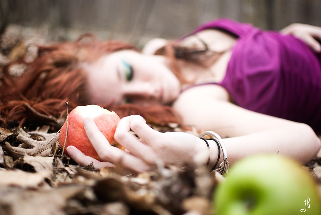
I like the idea for two. The foreground elements don't really add to the shot, the apple she is holding has a pine needle across it, her face would have been better faced up to the sky a bit more, and if the shot had been taken from a just slightly higher viewpoint. This shot has a LOT of potential, like the concept. I like the light.
3 is more of a snapshot, but a cool snapshot.

4 is the best of the series, for me. Creative shot, nice angle.
 
Thank you for the CC! They are all natural light, I'm just now learning to use off camera flash.

Thanks Trevor and MReid, I think I have a couple with her all in focus, and different angles etc. I'll dig through them and see what I can find that might be better :D

Petto good point about the line, I didn't even see that!

Gipson, Title King <3

Thanks again!
 
#1 - really good.

the rest - ehhh.
 
Title: How do you like them apples?

6874036221_7a5b41af33_b.jpg
 
Thanks Disko and Schwetty :D
 
Bossy.. while I love the concept on #2.. and the way you shot it... the green apple in the foreground is a distraction... colorwise, brightness and OOF wise. I think it would be a stronger image without it.
 
Last edited:
cgipson1 said:
Bossy.. while I love the concept on #3.. and the way you shot it... the green apple in the foreground is a distraction... colorwise, brightness and OOF wise. I think it would be a stronger image without it.

Agreed...

Number 4 is nice as well. I like it.
 
After a long internal debate(haha) I agree Gipson. I like it because it added color to an otherwise very warm image, but the placement is less than ideal.
 
Thanks Gipson and Mach :)
 

Most reactions

Back
Top