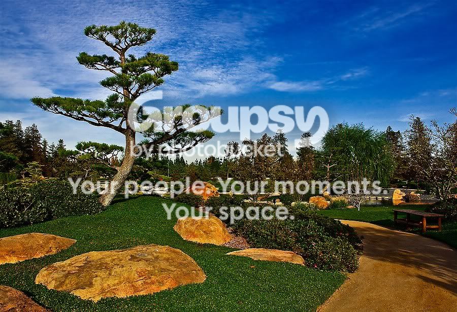
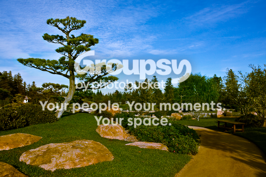
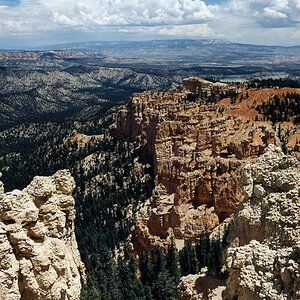
I think the first image posted just has the saturations unnaturally high. The sky is just too blue, the greens too green, etc... It's not horrible, it's just a bit over the edge. The edit really brings out a bunch of white pinpoints as well. I find them distracting.
In terms of composition, you have a lot of things leading the eye toward the center of the frame -- the road winds around toward the center, the tree leans in ot the center, the eye gets to the center and there's... nothing. I think this is why it lends itself to being criticized as busy, primarily because it doesn't have stuff going on where it should.





![[No title]](/data/xfmg/thumbnail/34/34347-8b81549fefc38aca163688d07a9f5ced.jpg?1734164893)
![[No title]](/data/xfmg/thumbnail/39/39472-acea19526f2c08f92fd1e95a92191bc2.jpg?1734173564)
![[No title]](/data/xfmg/thumbnail/34/34345-5642c495cae8d6c7bb83c28664146cf1.jpg?1734164882)