wedding...C&C

bunny99123

TPF Noob!
Joined
Apr 24, 2012
Messages
771
Reaction score
110
Location
Sherwood, AR
Can others edit my Photos
Photos OK to edit
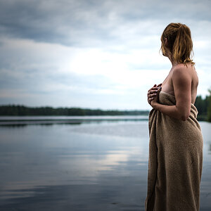
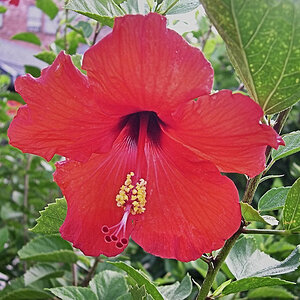
I photographed a small renewal wedding last weekend. C&C is welcome. Outside photos were taken at dusk, so didn't turn out so good.
#1
$Bride and Groom 1 low resol.jpg

#2
$bride low resolution.jpg

#3
$Dress 2 low resolution.jpg

#4
$IMG_0789.jpg

#5
$Ring (1 of 1).jpg
 
I like the set up in #5!
 
The first three seem very soft to me. And since the hedges in the background of the outdoor photos seem to be too sharp, I would guess your aperture was off. "Taken at dusk" is no excuse; the proper settings and a fill light would have made a lot of difference.
 
The dress should be white, not blue/red. Check your white balance.
Consider a telephoto to get yourself farther away from your subject and shoot it wide open (ƒ2.8 or better).
She seems a little stiff, uncomfortable. I really like the chair, and I feel it could have been used a lot more creatively. Put some more distance between the chair and those hedges, and shoot from a lower angle/POV.
The wall behind the dress kills it. It feels too flat. A nice large window and that chair would have made a nice place to set up the dress shot, and the bible shot.
 
I agree that the ones of the bride seem a little soft. #5 is very nice though, I think it is the best of this set.
 
I do think that a little less depth of field and tack sharp focus on the bride would have been more flattering. The depth of field in number two is kind of odd looking as well. It looks like there are several blurry spots and then when we get to the bush in the back it's all of a sudden completely blurry. Maybe it's the compression? You didn't try and do faux shallow DoF did you? lol
 
#5 is your best shot. The others look like snap shots. The WB is way off, the composition is not very exciting, and the angles are not very flattering to her arms. Sorry.
 
#5 is your best shot. The others look like snap shots. The WB is way off, the composition is not very exciting, and the angles are not very flattering to her arms. Sorry.

Yeah, this. Watch for arm rolls. Catch them while their tea cupping.
 
I'm not one to candy coat like so many on this forum, but these are awful. I can understand why you were concerned by a second shooter taking over.
 
Having a look at the second photo large it appears that you've gone in and selectivly edited to increase the blurring on the background areas. However you're selection is poor and you've left some areas sharp, for example around the raised foot there is a clear "halo" of sharp grass where you've not blurred it like the rest nearby, which creates a very "sloopy" feel to the editing (I'm not saying that to be harsh, but its a very clear error and should be something that you notice when editing very early on).


I would like to urge you to caution and suggest that you take a moment to pause and step back from your photos. I feel that you need to strongly review your methodology in both your shooting and editing phases if your desire is to deliver a quality product to your clients (as I'm very sure it is).
I would encourage you to read the critique thread in my signature below and to ask questions, lots of questions. We have a great community here on the forums and many people who can not only directly give you advice but also point you in the direction of reliable information sources. If you tap into that you can advance yourself in a self learning environment a lot.
 
#3 looks like it's backdropped against a 70's popcorn ceiling...never a good thing. Keep working though!! Some different angles would be good for most.
 
well, since the negative aspects of these pictures have pretty much been beat to death, I will try and focus on a few positive aspects.
#2 was not a bad idea, but definitely needs some WB and exposure correction. same with #3, although the WB was not off near as much.
#3 was a nice shot. the background was lacking, but overall a good attempt. the exposure and WB were better on this shot than the rest.
#4 has a very bad tilt. it doesnt work well for this photo.
I like #5 despite not being a fan of B&W, and would like to see the color version.
your photos are OK to edit so...i took a very quick stab at the two i thought were the best, even though they were low resolution versions.

hope this helps some, and dont get discouraged.

-Jason


View attachment 38288
View attachment 38289
 

Most reactions

Back
Top