Wedding Dress

Thayli

No longer a newbie, moving up!
Joined
Jun 13, 2012
Messages
146
Reaction score
48
Location
United States
Website
www.facebook.com
Can others edit my Photos
Photos OK to edit
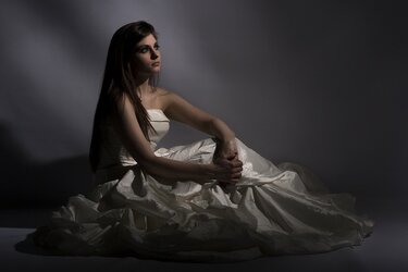
Had this dress lying around for last two months and never did anything with it, so decided tonight to make an effort, and also try something new. Mainly really harsh light.

I must admit i like them, theyre different for me, but I also know that I'm probably about to get ripped into about ridicoulous lighting. This may be a perfect example of what Cgibson means when he says 'you only like it because you're too stupid to know any better' (Of course he would never say it quite like that lol).

$1.jpg

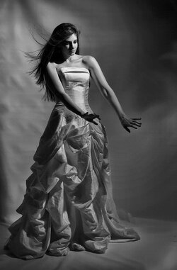
$2.jpg
 
I'm too stupid to know that I'm too stupid to know better, but I absolutely love the second. :mrgreen:

Something about the first one and the lower part of the dress isn't not working for me there. Its one of those scroll down things where you like it, like it, like it...don't like it.

I'm sure someone smart enough to know will come along and say different!

Thanks for sharing these!
 
In the first, her face is lit beautifully, but the dress is so dark. Isn't that why you shot these? To showcase the dress? Also, idk about that pose... it seems awkward and unfitting for the "theme."

The second, I like the pose a lot better. It still seems a little dark.

I commend you for using proper orientation in both!
 
I feel like these a really close. The light you're using is light her face pretty well, but I feel like there needs to be something in the shadows. Right now the dress is a murky grey color. I think you need something down there to define it a little bit. Ok, after typing that, I looked again and I think the first one would be much better if you just had a larger modifier that would light her whole body.
 
These are very neat... A little random and I think the second one is less random (and sexy!)but overall both are neat. Do more. Experiment more.
 
I prefer the first image, aside from the fact that the dress is too downplayed, as some here have already mentioned. I'd get some backlight on the dress and fill in the front to give it almost a glow. Make that baby pop ;)
 
I like the first one better due to better light on the model's face. The shadows on her arms don't help any. I think the fall-off is good, but you're getting her shadow on the backdrop.

Second one needs more light on her face.
 
I don't like her expression on the second. Doesn't fit the sexy pose. Maybe tilt her head down more with more of a serious expression.
 
Trash the Dress!!!!!!!!!!!!!!
 
I love this style of lighting. It's very dramatic. Derrel could probably give us a good essay on the religious overtones of this kind of light, it certainly hits a lot of buttons for us western viewers.

This doesn't have anything to do with "wedding dress" per se, it's just a big glorious shiny gown here. Think of her as the queen. She's Morgan le Fay, she's a modern day Cleopatra, and something powerful is about to happen.

ETA: Lighting debates are one of the more pointless things. You can stick lights anywhere, with any modifiers you like. You're gonna get something. If you like it, you win. Who cares if it hits the current fashion trends in lighting? Who cares if it matches Sears Portrait Lighting Standards? If you're being paid to produce a corporate head shot, that's one thing, but if you're just making pictures, stick the lights wherever pleases you and damn the critics.
 
Your paper backdrop is too distracting to comment on the lighting. Always check your background.
 
I love this style of lighting. It's very dramatic. Derrel could probably give us a good essay on the religious overtones of this kind of light, it certainly hits a lot of buttons for us western viewers.

This doesn't have anything to do with "wedding dress" per se, it's just a big glorious shiny gown here. Think of her as the queen. She's Morgan le Fay, she's a modern day Cleopatra, and something powerful is about to happen.

This is almost exactly what happened lol. My original title for the thread was 'Complete randomness' as thats what it felt like while shooting. (I was concentrating so much on looking for drama in the lighting that I pretty much lost sight of anything else). I posted them on Flickr just before here, and the title of #1 was Sun Worship, and that in itself was a toned down version of my first title which was going to be Bride/Sacrifice To The Sun, which I felt went a little far even for a heathen like myself. So yeah, although the dress isn't the star, it was the one common denominator in the sequence, hence why I used it for thread title. Very misleading lol.

Anyway, I took about 140 shots in a couple of outfits, this was leaving-the-best-to-last. I was really tired and only edited 5 before bed and was beginning to have that niggly feeling that I may like them far more than I should, so figured I'd throw a couple on here and flickr to see if anyone else saw what I saw. Appears I'm not entirely wrong so thats always a good start to my day. Thank you to all the commented as always, and you have put a smile on my face for breakfast, and I'll prob spend a couple of hours today going through the rest. If any are decent I'll throw them up in the thread.

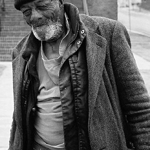
One more of the edits from last night:

$3.jpg


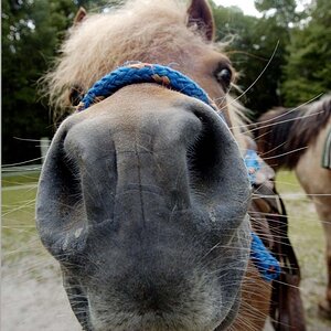
EDIT: And my first edit from today, trying the black and white conversion.

$4.jpg
 
Last edited:
Your paper backdrop is too distracting to comment on the lighting. Always check your background.

And there goes the happiness. :lol:

You think it would have looked better with just a smooth background? All the beginning shots were with a white blown out, then I went to grey smooth and it was just... well bland really. I distorted it up a bit (its vinyl) and I really liked the swirly cloudyness of it, so kept it.
 
You, Sir, are getting somewhere. :thumbup: I like #1, especially the lighting on the face and upper torso. I like the pose but the shadow on the back of her right hand/forearm is harsh.

If I were you I'd quit the day job and spend the rest of my life shooting that model with occasional breaks for eating and sleeping. :lmao:

P.S. I like the rumpled background. It looks deliberate (rather than careless) and for me it works.
 

Most reactions

New Topics

Back
Top