Samanax- I went back and pulled up the straighten tool for the first picture and that front post was ALMOST dead on. I can't believe that you noticed it was SLIGHTLY off. I would have never seen it.
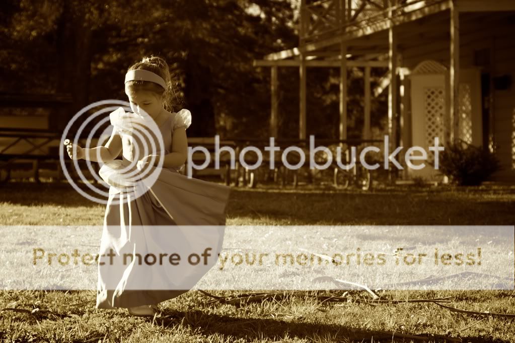
Photo #2: I don't usually do Sepia too often, but I felt like I had caught such a sweet moment with her but the lighting was terrible (we got to the park a little too early for the "sweet light") but I wanted to save the photo. I was just messing with it to see if the sepia toned down the harshness a bit. I guess it doesn't work.
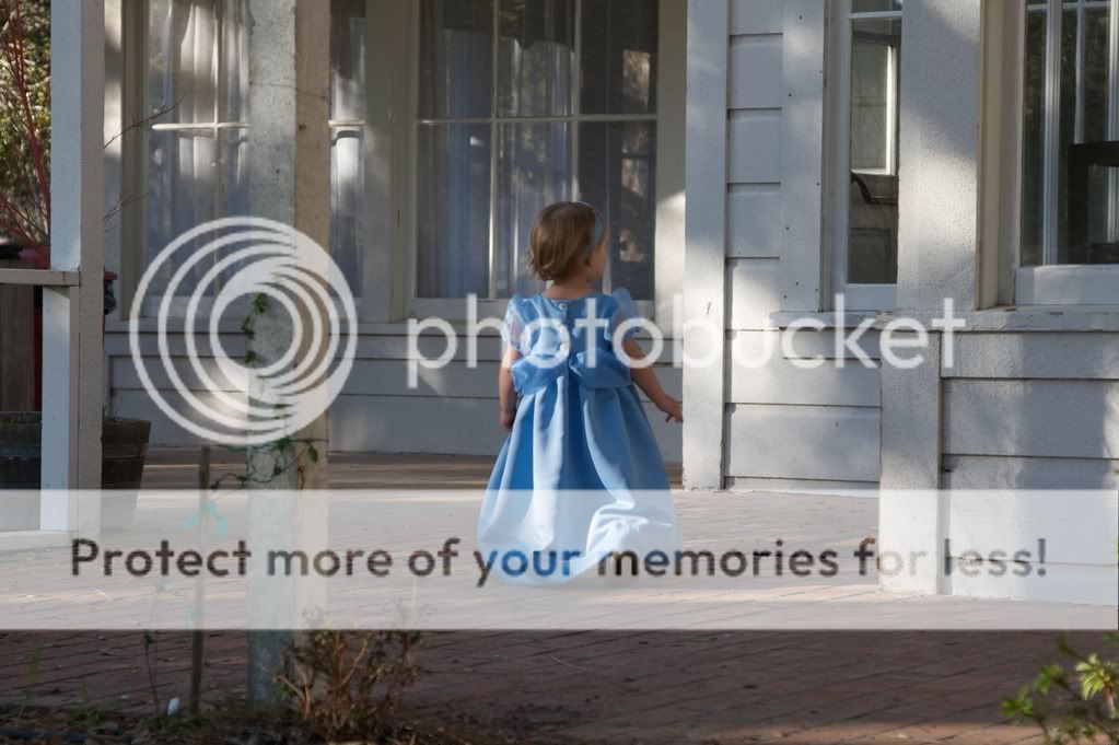
The second one just feel kind of "old-timey" with the porch and flowing dress I just thought a desaturation might look nice. As I've said many times, I don't know anything about PP so advice is always welcomed. I don't want to make a good (or OK) picture worse.
Samanax- I went back and pulled up the straighten tool for the first picture and that front post was ALMOST dead on. I can't believe that you noticed it was SLIGHTLY off. I would have never seen it.
Photo #2: I don't usually do Sepia too often, but I felt like I had caught such a sweet moment with her but the lighting was terrible (we got to the park a little too early for the "sweet light") but I wanted to save the photo. I was just messing with it to see if the sepia toned down the harshness a bit. I guess it doesn't work.
The second one just feel kind of "old-timey" with the porch and flowing dress I just thought a desaturation might look nice. As I've said many times, I don't know anything about PP so advice is always welcomed. I don't want to make a good (or OK) picture worse.
I can't offer any PP advice for this type of color work since I don't do it myself. My friends play around with it but I think they just use the pre-sets in Lightroom 2 most of the time.
Just out of curiosity, what did these look like in color? Did you try to just take the colors down to give them a soft pastel kind of look?
I went back and was playing around with toning down the blues and purples for the porch picture and it DID give a softer/pastel-like look. It looks pretty similar though to the desaturation except the whites stay vivid. So I think it looks nice that way.
I love shot 2 as well. I think it works great sepia toned (of which I'm a fan of sepia and of desaturation but not to the point of B&W.) Both versions are great. The original color shot is great as well.
Thanks for posting them...I do like these pictures a lot more than the ones in the first post. I'm a color-kind-of-guy (BFA Fine Arts - Drawing & Painting).
I will concur on #2. In general, you leave leading room to allow movement within the frame, but playing against type here works. Adults would walk into a frame, kids... they wander off and do whatever they want. Both sepia and color could use a bit of tone work and both could do with some de-hazing, but technical bits aside, it's a really nice capture.
I will concur on #2. In general, you leave leading room to allow movement within the frame, but playing against type here works. Adults would walk into a frame, kids... they wander off and do whatever they want. Both sepia and color could use a bit of tone work and both could do with some de-hazing, but technical bits aside, it's a really nice capture.
Thanks for the input. I had the picture framed with room to the right because she was initially heading in that direction, but turned suddenly to the left (thus the dress swing) and I lost my framing. It is SO challenging to anticipate where kids are heading :er:.
Also, thank you for the technical advice. I am just trying to make the switch from Aperture to Photoshop so I can have more options on PP. I don't really know how to use either, but at least there is a TON of info out there on PS (not to mention all of YOU experts) and not so much for Aperture.
Thanks for the input. I had the picture framed with room to the right because she was initially heading in that direction, but turned suddenly to the left (thus the dress swing) and I lost my framing. It is SO challenging to anticipate where kids are heading :er:.
Well, you did good. Our 5 year old's nickname is Zipper. Probably 90% of the shots I have of her is from about her ear back because she is alway running out of my framing, LOL. I definitely need to work on my up close panning to capture her, or work on my sneaking so I can sneak up on her without her noticing :mrgreen:.


![[No title]](/data/xfmg/thumbnail/39/39442-c7791194bfea1b4d6bd382b004fb8488.jpg?1619739033)


![[No title]](/data/xfmg/thumbnail/35/35875-613296cbb015a9d4bc5b47aca161290e.jpg?1619737200)