What's new

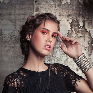
What do you think of the color here?

That's how your eyes viewed this scene.
No it isn't. Her eyes saw it in 3D, not 2D, her eyes saw more dynamic range, and many more gradations of color tone.

You achieved an amazing bokeh.
Bokeh is a function of the lens construction and the Circle of Confusion the lens produces. The only control over bokeh a photographer has is lens choice.

A blurred background results from depth-of-field (DOF) - a function of lens focal length, subject to image sensor distance, subject to background distance, and the lens aperture used.

DOF and bokeh are not interchangable terms.

There is a difference in the way a Mom see's an image and a fellow photographer see's the same image.
The Mom's perspective is mostly emotiona;l while the fellow photograpers perspective is mostly technical.

In general, the more technically accomplished the photographer, the higher they can price their work.
 
make a saturation adjustment layer and knock the pink down a tad, imho
 
You could try adding some more yellow to the background so it ties in the saturation of the subject. Other than that looks good!
 
I agree that the bright yellows in the background compete. Just create a saturation layer, select yellow in the menu. Adjust luminosity and saturation to tone it down a bit. Now create a mask, press alt backspace or ctrl backspace (depending on your foregrond/background color setup and it must be the default colors ) to fill the mask with black. Now use a feathered brush to paint white on the yellow background areas. Adjust the saturation layer more, and its opacity until it looks good. I would also use a saturation layer to lower the pink as someone else said.

I do like the image though and dont think it needs much.
 
Id probably add some darker contrast to the picture not a lot I agree with an earlier post that your top colors are competing I am far from a professional as well so from me just more of a suggestion I do however really like this picture the pose is great and it seems to come easy I like pictures that don't look as though they are trying to "hold it" for you.. Kids are harder to capture you did a great job doing so...
 
Yeah I agree if you bring down the saturation a bit in the pinks it will be perfect
 
Thank you all for your feedback, it's very much appreciated. KmH, there will be a day when I get positive feedback from you on one of my pictures! lol
 
[/QUOTE] In general, the more technically accomplished the photographer, the higher they can price their work.[/QUOTE]

Yet a mother's child is priceless.;)

I do agree the pink is a bit overly pink.
The face and skin seem strongly softened, almost too much.
 
The pink color is too much and the back ground look blur a liitle bit

Patkoch

10 Fascinating Facts You Didn’t Know About Nikon D3100 shopnowweb.com/nikon/10-fascinating-facts-didnt-nikon-d3100
 

Create an account or login to comment

You must be a member in order to leave a comment

Create account

Create an account on our community. It's easy!

Log in

Already have an account? Log in here.

Back
Top Bottom