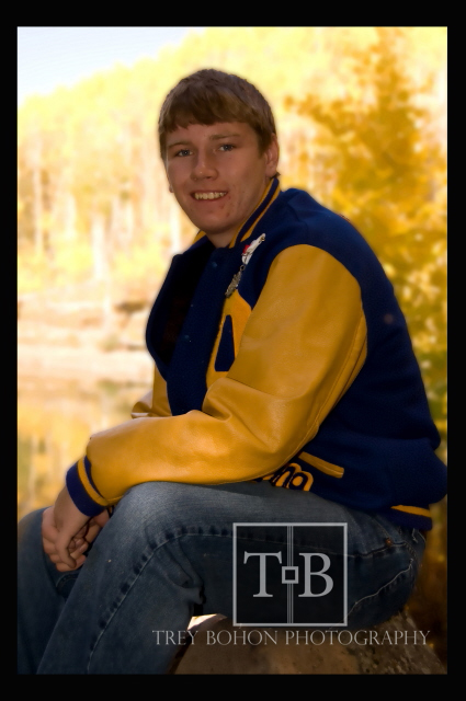
One thing that stands out to me immediately: apart from the girl, all your clients wear clothes that largely blend with the background. It makes your job quite difficult. You got away with it with the first photo, but not with the second. Brown sweater, brown wheel, brown (ish) eyes, hair and background - it all makes the pic colorwise as dull as a brownie.

Other than that - the first photo is interesting even though the composition is weird. Proportions are skewed probably due to the short focal length. Being a cynic I would turn his head even more and put it on a plate :twisted:
Whites are seriously overblown there. It is a big no-no. But again you (kind of) got away with it all that thanks to the boy's lovely smile. I like the fact that all of your clients look more or less relaxed and comfortable - that's another credit to you as a photographer.
I am not impressed with the composition of your photos as it lacks space and air to me. They are very closely cropped and center-weighted, as a result the pictures ( apart from the first one) lack any dynamic tension, interesting balance ( or if it is here it is wrong - just look at the falling boy on the 2nd photo) and look very static. The background serves no purpose there.
Have you tried to use a built-in flash to illuminate the face on the last photo? It is too dark, and the background is, again, overblown.
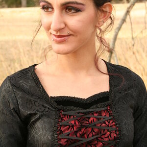
The girl is probably the best photo, even though you could use the light more to your advantage. But I have some problems with the upper part. It is cropped too tight above her head, and look at the background: what is it - a lake, a road ? I can not tell and this narrow bluish strip should not be there, the background should be all grass and leaves.
That is my first impressions and what really springs to mind first. We have different eyes of cours, but I hope it helps.
Oh well, it is the 2009 post, just noticed. Anyway.








![[No title]](/data/xfmg/thumbnail/36/36670-546c6128f51bbe69923c2eb6fd4fa438.jpg?1734169173)

![[No title]](/data/xfmg/thumbnail/35/35946-771bfce9b2727c9126587d96c471da80.jpg?1734167737)
![[No title]](/data/xfmg/thumbnail/32/32929-22e23acc63d6ecb25e5ee941be87121f.jpg?1734162700)