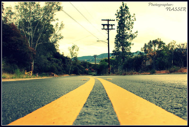
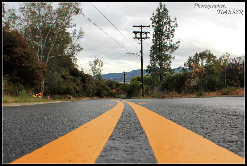
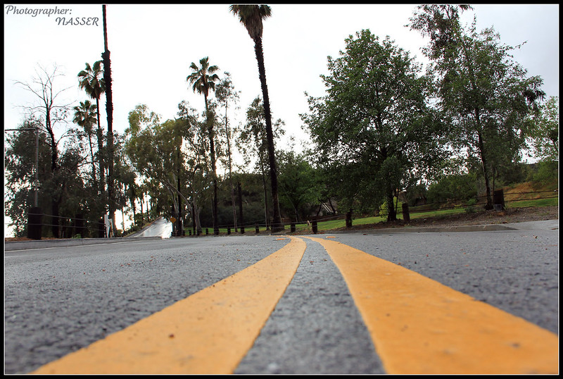
You could have adjusted the yellow strips to the very photo corners.
Posts and wires are disturbing. I guess a little editing would fix it.
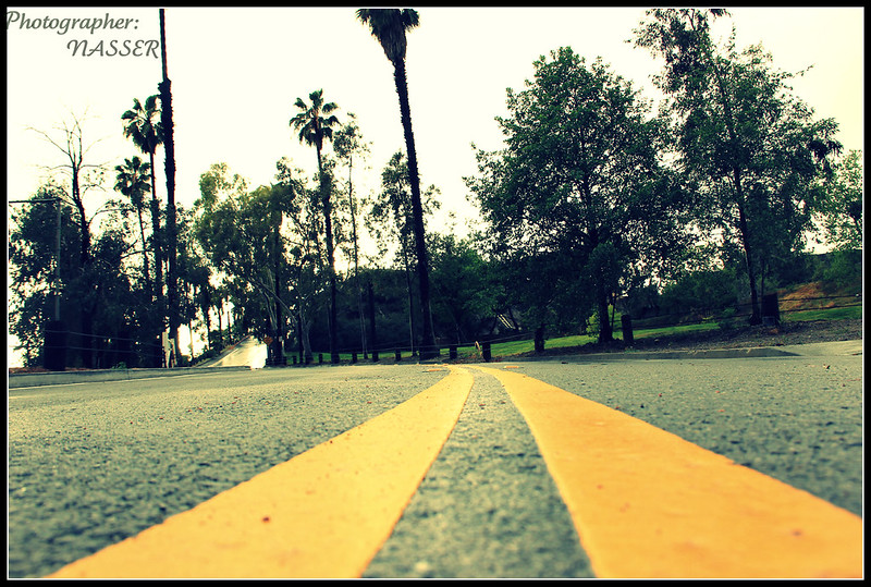
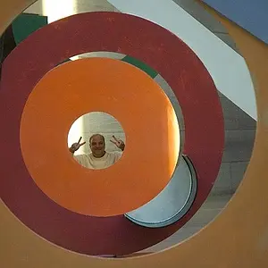
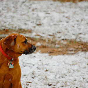
#2 and #4 need w/b correction.
You could have adjusted the yellow strips to the very photo corners.
Posts and wires are disturbing. I guess a little editing would fix it.
#2 and #4 need w/b correction.
Nasser:
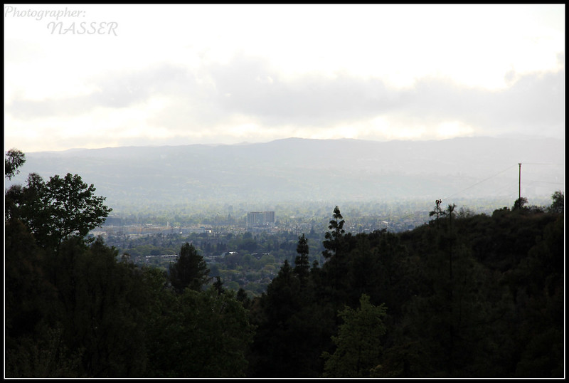
#1: What's the subject you want us to see?
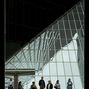
#2-5: The lower half has some promise, but the upper half is visual noise. If you doubt that, put your hand over the lower half and find the interesting subject in the upper half. Leading lines, curves, etc. are all excellent compositional elements, but they need to go somewhere. Your very foreshortened view lets us know they are there, but they don't do anything interesting.

i like the double yellow leading lines. Ive used this before for shooting cars. but they just take you into a cluttered and boring subject. i'd try for a more scenic background with less fencing and telephone poles.
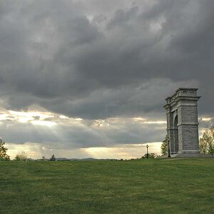
#1: This is a peaceful scene, even though without much things special about it
#2  have some green color cast in them; right?
Among the set of road shots the second( third in row0 is the best with fine composition, color balance etc. If we can include road in a scenery, i think power lines can be taken as a decoration there and here-not always- i like to see the power lines
If some thing appears prominent in image, it is better to include it completely within the frame; in the last two images the tip of the palm tree is cut