hello Josh; welcome

Please number your images
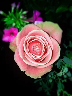
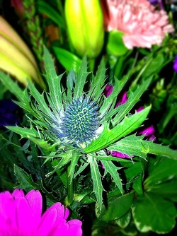
The problem i see is regarding composition-the placement of the main object withing the frame; placing them at center is considered a bad composition. That is the problem with #6, #7 and #8.
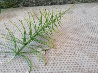
In #2, the thin triangular strip of land seen at the other end, kills the image; placing the plant diagonally is a good idea here
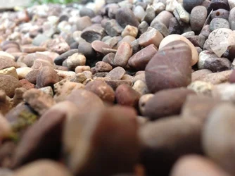
In #3, the stones in the foreground are blurred and they are heavy too. Such a thing is a visual disturbance and even if beautiful things are beyond there, they won't get good attention
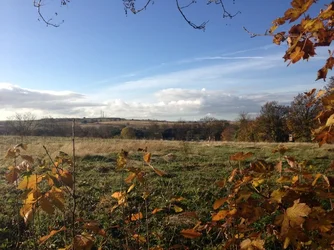
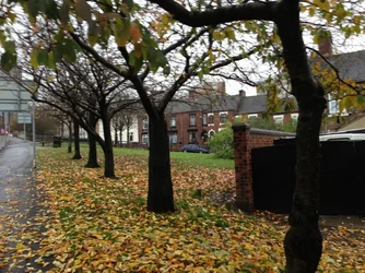
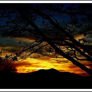
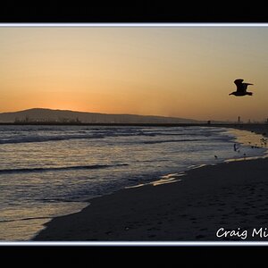
Both your landscapes are lovely. The first of this may said to lack a point of interest...but the colors are the POI here and so it works
Avoid flash on flowers as far as possible( i too sometimes use flash on them

)
The last but one image is good for nothing (sorry; i am harsh on this
)
The last image is colorful, but tomatoes are not sharp...and i did not like the diagonal barrier ...what is that?
Regards