RxForB3
No longer a newbie, moving up!
- Joined
- Feb 10, 2012
- Messages
- 654
- Reaction score
- 76
- Location
- Yakima, WA
- Can others edit my Photos
- Photos OK to edit
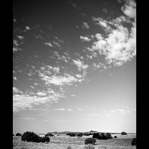
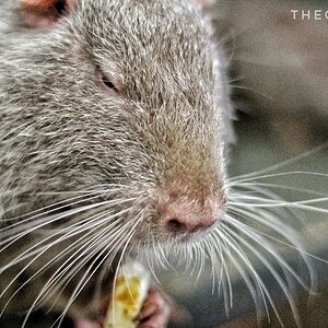
A couple from my backyard. Please make lots of suggestions if possible. I'm here to learn!

Fire and Nice by RxForB3, on Flickr

Flame by RxForB3, on Flickr
Fire and Nice by RxForB3, on Flickr
Flame by RxForB3, on Flickr


")