What's new

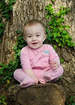
What's wrong with this portrait? Please C&C!!

ArtFreak

TPF Noob!
Joined
Dec 30, 2013
Messages
58
Reaction score
10
Location
United States of America.
Can others edit my Photos
Photos OK to edit
$14118522859_e5cd20b6cb_b.webp

I absolutely love this photo...in theory. The model is about as gorgeous as it gets and I always love a real nature backdrop, but for some reason the color just does not look right to me. I've played around with it and it's still bugging me. Have I just been staring at the same picture too long or is there something I should be fixing here?
Thanks for all opinions!
 
I'm not on a calibrated monitor right now, but the colours look fairly close to me; the child is slightly under-exposed however which may be what you're seeing. What really concerns me are the large, square-ish catchlights dead centre in the eye. Were these added in post, or did you actually have a softbox pointed directly at the child on the lens axis?
 
1. skin color looks off
2. an infant that age could fall off
3. he's wearing a pink onesie
4. catchlights in the center of his eyes
4. distracting background
 
Theres more light on the tree than on the child, slightly distracting.
 
I think the biggest element that makes this a snapshot vs a portrait for me is the clothing choice. You don't usually find pajama portraits on anything other than a Christmas card. I'm not sure what the natural skin tone is of the child, but it looks a little yellow on my ipad screen.
 
the pic is over exposed which effects the infant skin tone
distracting background
 
It looks like you used a hot shoe flash unit that was not set to (or could not be set to) the focal length of the lens you used and most of the light went over the child's head.
Note the shadows under the eyes and nose because the light was above.

The center of the eye is a poor location for catch lights, which is why off-camera-flash (OCF) is used for portraiture by advanced amateur and professional photographers.

The tree bark is very busy and makes a distracting background. For that matter, another hallmark of high quality portraits is a subject that is many feet from a background so the background does not steal viewer attention.
 
I actually really like this photo. With Lew's adjustments it is adorable.
 
If you darken the tree and sharpen the baby, except for the teeth, it should look great.
I always suspect shots made in the shade of being blue and around foliage as being gree.
It seems to overwhelm any auto-wb

get a color-checker, money well spent.
 
Thanks so much everybody! Sorry to just now be responding, I really appreciate all of the feedback.
 
What really concerns me are the large, square-ish catchlights dead centre in the eye. Were these added in post, or did you actually have a softbox pointed directly at the child on the lens axis?

The catch lights are actually from natural light, the sun was setting behind me. I'm not sure why they're so square...I did make them a bit brighter in post but didn't change the shape.
 
1. skin color looks off
2. an infant that age could fall off
3. he's wearing a pink onesie
4. catchlights in the center of his eyes
4. distracting background

Yes, SHE is wearing a pink onesie. hahah :D Her mom's hands are literally right outside the edge off this picture, ready to grab her if need be. But she does look a bit precariously perched, doesn't she? LOL

Thanks for the feedback! WB is something I'm still struggling with so I appreciate fresh eyes.
 
The baby did look a bit desaturatrd, color balance was off mainly, the edit posted by traveler bought most of the color back into the skin.

Could've chosen a softer background as compared to the sharp grungy bark of a tree.

The bags under her eyes are too prominent, try lightening it in post.

Sent from my HTC One using Tapatalk
 

Create an account or login to comment

You must be a member in order to leave a comment

Create account

Create an account on our community. It's easy!

Log in

Already have an account? Log in here.

Back
Top Bottom