Which is best, and why?

RxForB3

No longer a newbie, moving up!
Joined
Feb 10, 2012
Messages
654
Reaction score
76
Location
Yakima, WA
Can others edit my Photos
Photos OK to edit
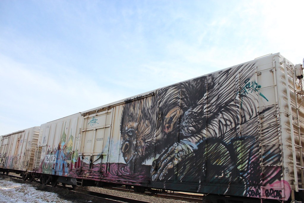
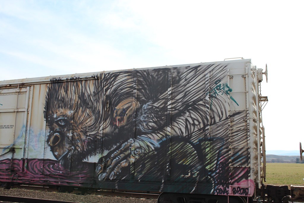
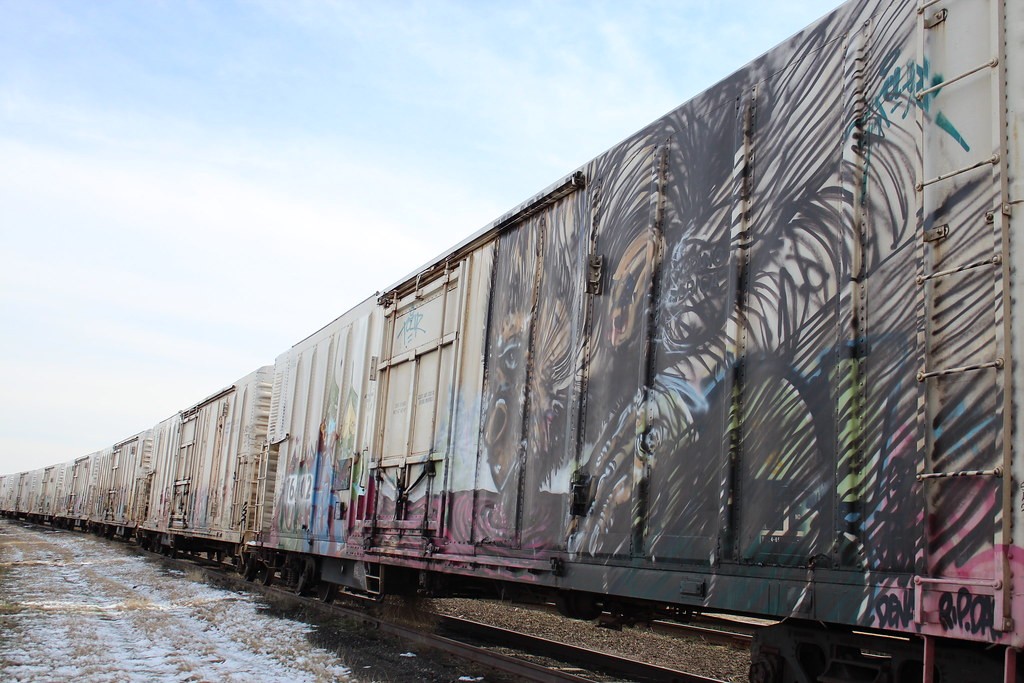
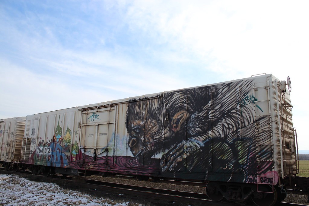
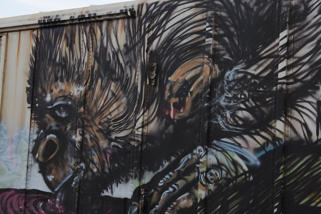
Graffiti rarely impresses me, but this REALLY stood out :) Once again, I wish I knew how to do it justice. I'm curious which shot you think is best, and why? Also, I should have a chance to shoot it again, so what should I do different next time? Sorry for the number of them, but I figured I'd give a large sample. I personally think the last one is the best by far, but among the others?

Out of curiousity, what is the legal aspect of shooting something like this. Obviously it can be considered artwork in its own right, so do I have the "right" to photograph it for personal gain? Obviously I wouldn't sell any of these as they're not particularly good, much less enough to do justice to the graffiti, but if I WERE and came across a random rail car in the middle of nowhere with some great art on it...?

1.
IMG_4685 by RxForB3, on Flickr

2.
IMG_4698 by RxForB3, on Flickr

3.
IMG_4705 by RxForB3, on Flickr

4.
IMG_4708 by RxForB3, on Flickr

5.
IMG_4710 by RxForB3, on Flickr

6.
IMG_4711 by RxForB3, on Flickr

7.
IMG_4712 by RxForB3, on Flickr

8.
IMG_4728 by RxForB3, on Flickr
 
Personaly like number3 as it has better composition. It has a nice lead in line

Think they are all a little bright and could do with some contrast

But hey I'm a noob

Sorry can't help with legal aspects. Suppose grafitti being an illegal activity there is no copyright
 
None of them are really "good". The bald sky in the early ones looks bad,and really detracts from the photos. You should have waited a few minutes. And used a polarizer. I suppose #7 is the best at showing the train car and its surroundings. #4 is a second-place finisher, even though it has that awful bald sky, it shows the ail car pretty well.
 
Considering that the graffiti was rendered there illegally by an artist, I don't think you have much to worry about.
 
Wish I had more time to reply, but...work...

What exactly do you mean by a bald sky? What would have been a more appropriate time of day? When the sun would be behind me?
 
What Derrel's referring to is the bland, rather featureless and "watery" sky. That is, it lacks contrast and interest. Ideally shooting early in the morning or toward evening would have improved things, however there is also the lighting on the cars to consider. My suggestion would be to consider the use of a polarizing and/or graduated ND filter to enhance contrast, saturation, and render sky detail more fully.

As for the legal aspects, I'm sure BNSF would be VERY happy if the "artist" identified him/herself in order to sue you for infringing on their work.
 
Being a noob myself as well, not sure I can comment on any methods of improvement. But, I do like #3 as well as it shows depth in the picture. :thumbup:
 
I really can't add anything more then what's been said, other then wondering just how long it takes to do that detailed Graffiti painting on a 50 ft freight car.
 
 
Last edited by a moderator:
3 shows the length of the train but isn't flattering to the grafitti image. 7 is the best for me because you have the green field in the background instead of the sky and it helps the train car stand out, but I would use a larger aperture to give you a more shallow DOF and blur the background. Be careful framing shots not to crop out something important (wheels). I would also add a little more contrast or warm the image slightly in post processing, as it looks a bit cool to me.

Interesting subject material! Are those flying monkeys?

As far as the legalities- I would think so long as you weren't standing on private property without permission, then all is fair game. Then again, bad things happen when I think. ;)
 
Thanks all for the comments so far. Unfortunately, I have to admit that I actually DID use a circular polarizer on the first 6, but obviously without much success :) Practice makes improvement, though! I think it's interesting that no one preferred the last photograph. Though I think the technique was particularly lacking in that one, I think the "monkey" and the figures on the other side of the train are all related. I have no clue what they are suppose to be, but I think the whole rail car was one big mural, hence why I lack the last one. Other than that, I definitely agree with what has been said. I like #3 a lot, but the whole point was the monkey and that gets lost. I guess we'll see what happens when I get another chance on Friday. Unfortunately I think I'll be driving by at an even worse time of day...
 
I'd have to say that you really need to look at line and movement, placement, lens length as well. I'd have to say that 6 for me is the best as it is close to exposed and is a different crop so the playfullness is appealing.
 
I think 7 is my favorite but I'm not fond of the framing of it. I like that you can see the artwork, which is the focus, but still see the whole medium as well as the interesting background. I agree with what mommy-medic says about a shallower DOF. I'm still a noob too, but what she said makes perfect sense and I think would make it more aesthetically pleasing. I personally don't like #3 at all because you lose all the details of the artwork, and from what I can tell the artwork is the focus, not the train.
 
I think you really need to try and go back to shoot this when the sun is behind you and hitting the train cars more directly. I think that will make the colors pop a lot more. As it is it just looks bland. I also think that a shot where you shoot from the left, with the green figures more in the foreground would come out nicely. The "monkey"? figure is much larger and you get no detail of the smaller figures to the left the way you shot.
 

Most reactions

Back
Top