Tight Knot
No longer a newbie, moving up!
- Joined
- Nov 30, 2010
- Messages
- 1,398
- Reaction score
- 159
- Location
- Boca Raton, FL
- Can others edit my Photos
- Photos OK to edit
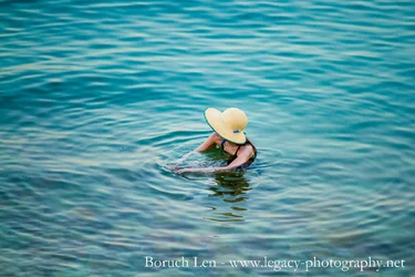
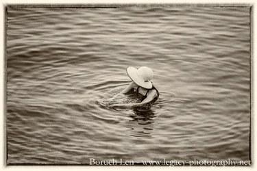
Hi Elie,Colour. With all due respect I think that your black&white processing lacks of structure on the hat to enhance its texture a little bit, and lacks of a touch of contrast.
Regarding the composition, I would have placed the subject towards the bottom-right corner to gain efficiency.
Hi pgriz,I prefer the colour version. As for the composition, I'd consider putting the hands in the center with the waves radiating from that point. The hands and the waves they create seem to be a unifying element in this image, at least for me.
Thanks limr,Color.
The trim of her hat matches the color of the water, which reinforces the idea that the ripples start with her, and it also connects the woman to the circular pattern, contrasting with how her arms break the pattern of the water.
Also, there is a nice texture added by the rocks beneath the surface, but in the black and white version, the rocks are kind of lost.

Hi pgriz,
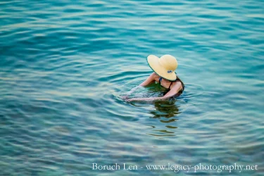
Thanks for the C&C. I have attached the crop that you suggested, let me know what you think. I really cannot make up my mind which I prefer.
Thanks frommrstomommycolor for sure
After cropping it, I see what you mean, and I definitely agree, the cropped version is FAR better. Thanks!!!Borush, the first image is about the hat (that's the central focus point). The second image is about the hands in the water. At least for me, there's more connection between the woman and her surroundings in the second. It's subtle, but alternating between the two, I prefer the crop I suggested to you.
Thanks RajNothing to add except, colour!!