rambler
No longer a newbie, moving up!
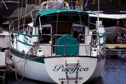
If you want to use color, you need to get rid of the red cover in the background. Red is a dominant color that draws the eye right to it. It pulls the eye away from your main subject, the boat, so it is a distraction. Here is one solution.
Use a Selective Color adjustment layer. Select the color red. Increase the Cyan and Magenta to soften the red. Then convert the image to B&W by adding the B&W Adjustment layer. Then invert the white mask to hide the B&W. Then using a white brush, paint over the red awning/cover to reveal the B&W. That is one way to remove the bright red distraction.
Use a Selective Color adjustment layer. Select the color red. Increase the Cyan and Magenta to soften the red. Then convert the image to B&W by adding the B&W Adjustment layer. Then invert the white mask to hide the B&W. Then using a white brush, paint over the red awning/cover to reveal the B&W. That is one way to remove the bright red distraction.
![[No title]](/data/xfmg/thumbnail/40/40310-01bec1b9b7918522bf21a09cf75c5266.jpg?1619739414)