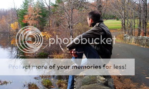
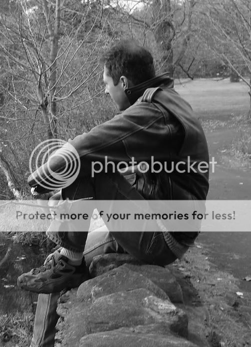
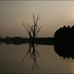
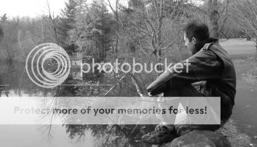
well honestly I prefer the first one because the second one is too flat. and you really don't know if there's a reflecton in the water or if there are trees andbushes only.
thanx!
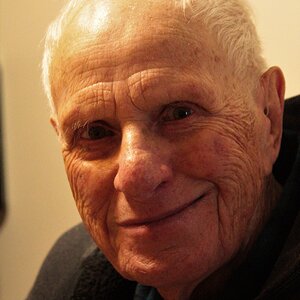
btw that's my father...
I think if I add some contrast to #2 the reflection will stand out some more... it's just that I think the colors are too distracting here, I mean it's not the essential.
Anyway, i'll be working on these later on, maybe i'll do some croping on #1...
Will be back later with results
i agree w/ 007's comment on the 2nd. the first one has nice colors, and i like the road on the right too, so i don't think i'd crop it out.
your one distracting foreground element you could clone out is that little branch on the left. cropping the left edge off would be easier than cloning over the branch, but would force your subject closer to the center which you don't want.
i do like the rocky ledge in the foreground much more than i like the white sky in the background, so you could see how it looks cropping a little off the top.
hmm, you're right and I didn't even notice that damn branch... When I was thinking about croping, i was thinking about cutting out a horizontal strip pretty much like #2 but i'll keep the road ;-)
Anyway, i'll try several version. Will try to post'em tomorrow.
Thanks a lot!
Hi.. I'm a baby in photography but in my opinion, each pic above evokes different emotions. The first looks like ur dad is enjoying his own company on a beautiful calm day and the second looks like he is thinking about some problems...maybe a small one. Well... that's me. But I personally like the first one.
:thumbup:
Gracias Joey, I didn't look at it in that way. actually since it's my father i don't get to notice some details about the ambiance...
Still working on these!
i agree w/ 007's comment on the 2nd, but also with Joey. While I was trying to figure out which one I Did like best it was hard b/c it does have a different feeling in each just b/c of the different head tilt!
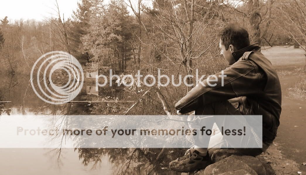
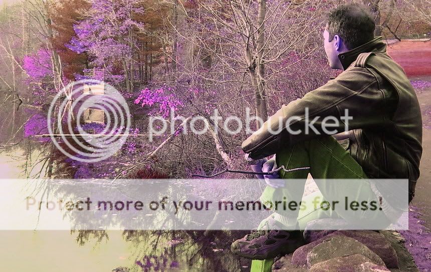
K, well here are some new versions. Actually nothing really surprising, just some cropping job... I'll try to come out with a sepia version later on.
What do you think of these? (they're OTE, if you have any new ideas)
heres my opinion on the first set... i love the colors and look of the first one and agree with everything said, although i feel like the pose in the second is alittle nicer just because you can see his nose. that adds allot to me. and in the second set i like the first and although i love that road behind your dad i wonder what it would look like cropped out alittle so hes almost at the edge of the pic. Its hard because it would made the "frame" of the pic a different shape... the second one there just feels (to me) alittle tight. and you dont know what he might be looking at, it only feels like part of the whole image, that maybe because i seen the others though... on the other hand, if you took the 2nd pic of the first set and by hand or digitally tinted the pic that might be a nice look with the fall colors...
I would say go with either the bright colors, which kinda of tells a story of what hes looking at. Or with black and white which tends to make me focus more on him, and the mood he may be in, seemingly peaceful.
I would say go with either the bright colors, which kinda of tells a story of what hes looking at. Or with black and white which tends to make me focus more on him, and the mood he may be in, seemingly peaceful.


")