
OP
OP
Alexandra
TPF Noob!
j3ffff said:I like the brownish-yellowish one. Good job with the photos!
Gracias Jeff! (I assume it's jeff... correct me if i'm wrong cause i'm not that good with nickname decoding, lol!)
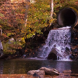
I think I'll start a Sepia-lovers club! (sepia's the name for the brownish-yellowish filter. hehe, I learned that last week, I'm so proud!) cause it seems to be a specific thing, I mean it really gives a specific feeling...
Or is it just me?


![[No title]](/data/xfmg/thumbnail/36/36643-92fe0dd9e247722bfefe299cd8a549f5.jpg?1619737670)