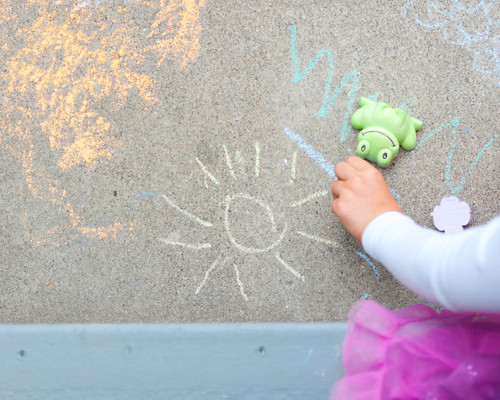
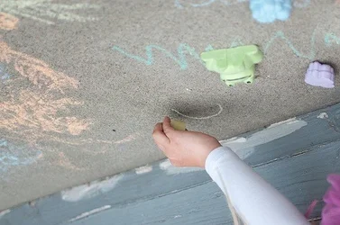
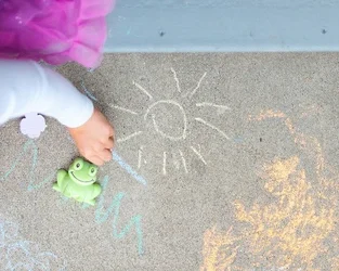
Mully states that the Point of View in the second is better; I'll expound upon that: it deals with "planes", and does that well. We have the plane on which she is drawing, and then the closer plane, on which we see a small segment of a frilly skirt or tutu. I am going to assume she is seated, or more likely, KNEELING, on a wooden stoop,step, or porch, and she is leaning over and drawing on the sidewalk. The drawings she has already made are shown, flat, on a broad expanse of concrete, with her hand and arm leading in from the lower right. It appears to me that she is placing the very last "sun-ray" on her iconic, kid-style sun drawing. The upper shot does not have the sun drawing completed yet, and the blue board on the diagonal is a strong element, but it doesn't advance the photo very much. Due to the shallow DOF in the first shot, and the angled view, the picture seems like a snapshot, with many disparate, boring elements, just randomly thrown together. The second shot appears to be a more-formal "look" at her drawing, the drawing is farther along, and the depth of field is even, and nothing is out of focus. Our eyes can easily see one, whole "depth plane", and we can use our minds to fill in some interesting missing information. The pink fabric? Says "girl in dress". The white-sleeved arm indicates that it's not in the heat of the summer. The upside-down plastic frog is kind of a kid-like, whimsical toy.
If you would like a better understanding of the compositional worth of these two shots, rotate them both, and look at each,individually, while viewing them upside-down. You will see that the first composition is little more than a jumble, a mish-mash, with almost zero cohesiveness--and the second one, not so.
<img src="http://www.thephotoforum.com/forum/attachment.php?attachmentid=40795"/>
<img src="http://www.thephotoforum.com/forum/attachment.php?attachmentid=40796"/>










![[No title]](/data/xfmg/thumbnail/37/37108-62307f01c11ef92f5655ed4501d565ce.jpg?1734169830)