Ok I think you're getting ahead of yourself here. Firstly a few things to note:
If you shoot in RAW and edit in Lightroom the colour space you are "working" in is irrelevant. Lightroom uses an internal colourspace called MelissaRGB until the point at which you hit the export button, or the open in Photoshop button. At that point it is converted to what you set it to. If you're working in Lightroom you should ignore the issue, and when you save an image to be uploaded to the internet save it as sRGB. Additionally one thing to note is that Lightroom is aware of the colour space of your monitor. This means that it converts colours to what it thinks looks right. Most web browsers are not aware of the colour space of your monitor which can lead you to have 2 100% identical files, in an identical colour space looking different in your browser compared to Lightroom. If you have a calibrated monitor, trust Lightroom only.
Ok secondly the display gamut of the 27" iMac is sRGB. This means in a colour managed setup you should see absolutely no difference between the various settings as your display is the lowest common denominator. Incidentally this is also why I advocate that people who have sRGB monitors who don't go off and get fancy prints done, don't work in wide gamuts as you suffer through extra hassles for no gain. Anyway the point is if you see a difference at all between your images you're doing something wrong in the conversion. ... You are converting aren't you, and not just assigning profiles right?
For your information, but not for your consideration you can check your browser's ICC support here:
Is your system ICC Version 4 ready? If you support ICCv2 profiles you're pretty good to go. This doesn't change a thing though because the other 99.999% of the internet does not support it, and thus you should still only ever use sRGB to display images on the internet. Again this does not imply that your browser is aware of the colour space of your monitor. The only one I am aware which does this is firefox and that needs to be manually set in gfx.color_management.display_profile in about:config.
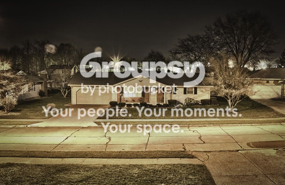
So your answer to the above 3 pictures changing hue. Do this experiment:
1. Copy the ProPhoto Image from your browser.
2. Create a new sRGB image in photoshop
3. Paste into this sRGB image, you should still have a green hue.
4. Click edit -> assign profile -> ProPhoto.
Looks as intended right? Maybe not:
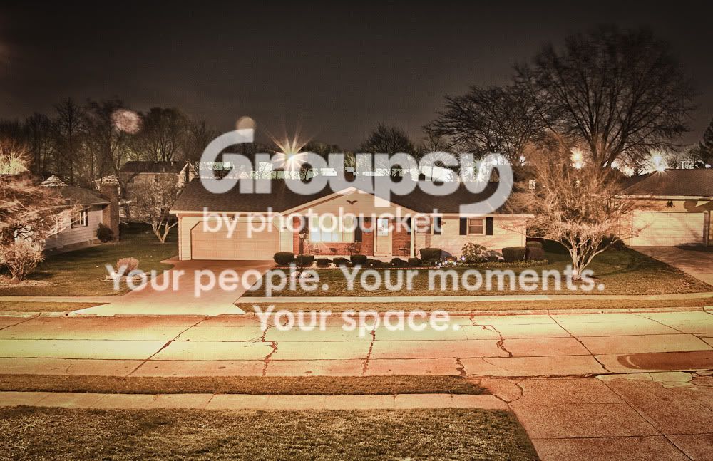
1. Copy the bottom sRGB image from your browser
2. Create a new sRGB image in Photoshop
3. Paste the image into Photoshop
4. Compare side by side.
Now you should see that the sRGB and the ProPhoto images actually look identical Hue and saturation wise. However the sRGB image is far higher quality, it doesn't have horrendous banding in the shadows.
What you have done is uploaded a ProPhoto RGB image on the internet, and either failed to embed the ProPhotoRGB ICC profile when saving, or viewed it using a non-colour aware browser. In this case you did the former meaning no matter how much colour awareness your software has it would need to guess at what the profile of the image was. This is the biggest no-no you can do. Never EVER upload an image without an ICC profile embedded unless it's an sRGB image.
The other thing you have done is caused the quality of your image to suffer by playing around with the colours in an 8bit space. Colour conversion is a lossy process just like converting a 16bit image to an 8bit image. That ProPhotoRGB image you saved above, despite being saved in a high quality, and despite the ICC profile missing being forgivable (you can add it afterwards) can never be as high a quality as the sRGB image because you don't have enough bits per pixel to display the wide colour gamut. So in the end there was a lot of screwing around, colour headaches, the results were unpredictable when viewed, when fixed the quality was lower than the sRGB image, and all in all you spent extra time for a lower quality product.
And the final kick in the balls is that I am viewing these pictures on a monitor that covers 97% of the AdobeRGB gamut, and since even on my screen the ProPhoto image and the sRGB image look identical hue and saturation wise, it means that the photo you took was never actually colourful enough to gain a benefit from a wider colour space to begin with.
AdobeRGB is a wonderful thing,
If you're making prints,
Of sunsets or oversaturated flowers with polarising filters,
And you never save the image as a JPEG,
And never display the image on the web,
And never convert it below 16bit,
And make sure the person printing it is competent to give the same care.
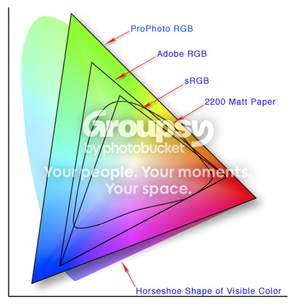
Then it is good. Don't just blindly follow all the pretty numbers and CIE diagrams showing how big a colour space is.













![[No title]](/data/xfmg/thumbnail/38/38265-4b75e7e05f8bf906800580ac7f7ddf60.jpg?1734172156)