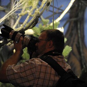
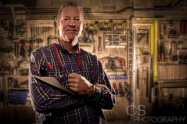
I don't like the side lighting on the subject. The front of his face is very dark and, due to the low positioning of the lights, his nose is oddly lit.
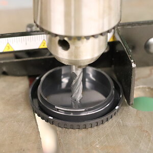
I also don't like the treatment on the bg. The HDR looks bad for one, and it's unevenly lit, bringing your focus off the subject and on the bridght reflection on the metal rule.
I suggest a more classic lighting approach to this challenge, coupled with NO tone mapping and NO clarity/structure slider. Am I correct in assuming this is a composite? if so, then actually pose him in front of the wall of tool.




![[No title]](/data/xfmg/thumbnail/42/42359-17c2ddbbb8366896f948a571f6c09cac.jpg?1734176895)