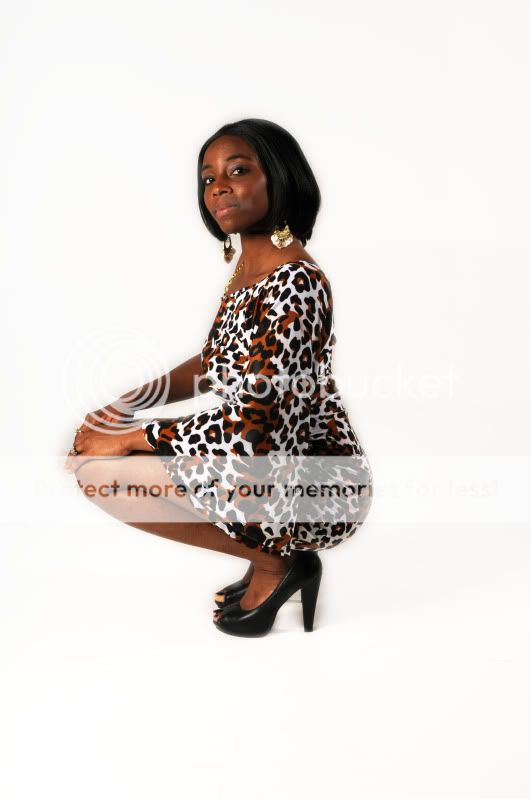
background is ok, but I'd boost the contrast up on it a bit.
model composition is a bit awkward: (not in that order)
#1 profile body language w/o profile face... VERY angular for my flavor.
#2 even when she turned her face, it isn't
supported by anything, just hangs up in the air - have her turn her shoulders a bit more to YOU - thus providing SUPPORT for the head.
#3 she turned her face, it isn't in profile view, not 2/3, or full face - which makes her LEFT side of the face bigger then it really is.
#4 CHIN DOWN - similar to #3 - huge chin (not pretty).
The good news is, if you choose to listen to me, you can't get worse

but
ONLY BETTER
Portrait Lighting
I often recommend David Ziser's blog.
Digital ProTalk Although I don't agree w/ everything he advocates, I think his lighting and portrait composition are gorgeous.
I'd say when you master basics (they probably started during renaissance period), braking the rules (so to speak) would still produce quality image.
Good Luck





![[No title]](/data/xfmg/thumbnail/31/31097-95606cf1bf0ecc862078bc333f20d4f7.jpg?1734159259)
![[No title]](/data/xfmg/thumbnail/37/37129-2b15d9f6bc8d43c2c1247a6c591d14aa.jpg?1734169834)
![[No title]](/data/xfmg/thumbnail/37/37533-7e5a25ced65c369c377ecf341b05e1d0.jpg?1734170690)