would like a non skateboard photogs opinion

andrew todd

TPF Noob!
Joined
Oct 13, 2006
Messages
42
Reaction score
0
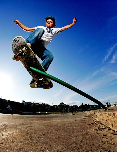
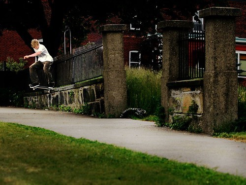
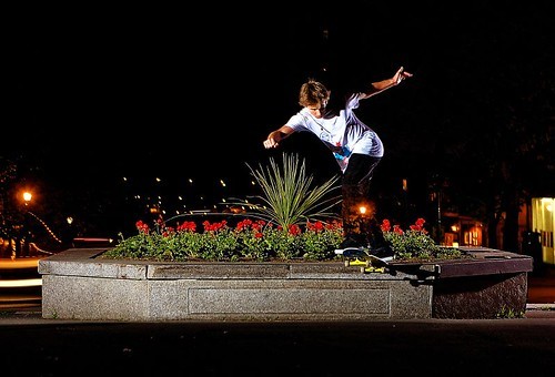
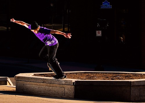
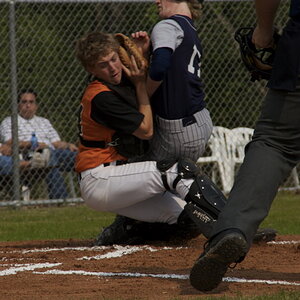
Skate photography is my passion.. i love it because it differs so much from other sports photography because of the way you get to uniquely shape each picture from the location to the lighting.

so im always getting critiques from other skate photogs but id really like to hear what photogs from the outside have to say... id really like to hear what you guys think of these......lighting, composition etc...


696351855_ea139b3f73.jpg


634688608_badaf37791.jpg


535682785_5ba4ee23ee.jpg


456475199_ef1f6cf12c.jpg
 
the first one is good. good color, angle and design elements.

the second is too busy. and there doesn't look to be anything nearly extreme going on, even though they are prolly close to the same height from the ground. i would get in closer, theres too much stuff.

third one is a nice idea, but i don't think it worked out as well as it could.

i don't like seeing through his legs. and the location doesn't fit the hip urban stereotype skaters gofor i don't think. it seems to be as much about the location as him, and i don't like it.

the last one i think would be better if the background was all black, and if i could see both his feet. even better his face. so perhaps had you been to the left some more it would have worked better.

overall i can see you know what your doing, but some of these are YEARS better in execution than the others. the color and contrast is great in all but the second!

good stuff, i look forward to seeing more.
 
I like the first one, colors and action is great.
 
hi again Andrew,

I have a feeling you'll take away all the Photograph of the Month Awards if you keep on shooting like the first one - its outstanding ! Have NO complains whatsoever !

Am not too sure of the second.. if the guy was somewhere nearer, I would try vignetting the lens to tone down the surroundings and emphasize him. that would work out well since he's in a white shirt. however, its not near the standards of the first one.

third is a bit artificial, I mean, it looks like a motion pose photograph... I still cant get over with the first one !!!! hahaa !

for #4, wish there were some more details on the background, like the blue "charlotte" board and the "no-parking" sign. elements get added to the photograph then and make it more lively, so when people look at it, not only the guy, but these elements are gonna attract eyes as well !

frankly speaking, the legs of the skater and the background has somewhat got merged.. but keep doing this, you'll reach massive heights !

sweet wishes,
sayambhu
 
aggreed, the first one is by far the best. Shooting up towards the sky gives both the illusion of height, and also gives a nice contrasty background. I like how you fill the frame with the subject because he's the most important part of the image. I like how his entire weight is balanced on top of that green bar. It draws visual interest because in my mind I'm wincing expecting that bar to just snap under his weight.

The others could use more work in my opinion. It would be nice to fill the frame with the subject more and somehow work in just enough of the surroundings to show the setting. It's really tough to work with a lot of elements to make a good composition because most of the time it ends up being really cluttered. That's why a solid blue background works so well. I know it's possible to create good compositions with that much clutter, but I'm just saying its a lot more difficult.
 
First one: Great! Can't get much better than that!

Second: Really cool. I like this one a lot. Contrast, colors. At first I was unsure about the composition of the skater but it works for me.

Third and Fourth: I'm not diggin these. They are good but the black sky is killing me.. Just a little empty to me.
 

Most reactions

New Topics

Back
Top