Would like criticism please

matt62485

TPF Noob!
Joined
Mar 20, 2009
Messages
553
Reaction score
7
Location
Wilmington, NC
Can others edit my Photos
Photos OK to edit
So I'm new here, and to photography (check my intro thread). Picked up Corel Paint Shop Pro Ultimate the other night and just got to fiddling with it last night. I'm still learning the ropes on my D40 and settings, but was wondering exactly what I need to look out for on my editing/photography. Here is a couple pix I've taken and attempted to make some artistic editing, comments, suggestions, critics welcome... please, any help is good :)

my biggest goal now as a new photographer is to get good angles as best as i can with my provided 18-55mm lens, learn about appropriate aperture and shutter speed settings, lighting etc. the first batch of pix i took a few days ago i had lots of areas with no data/blown out. im getting better as far as that is concerned but realize i have tons to work on.

anyways, no rush, but the more information i can obtain the better. thanks!
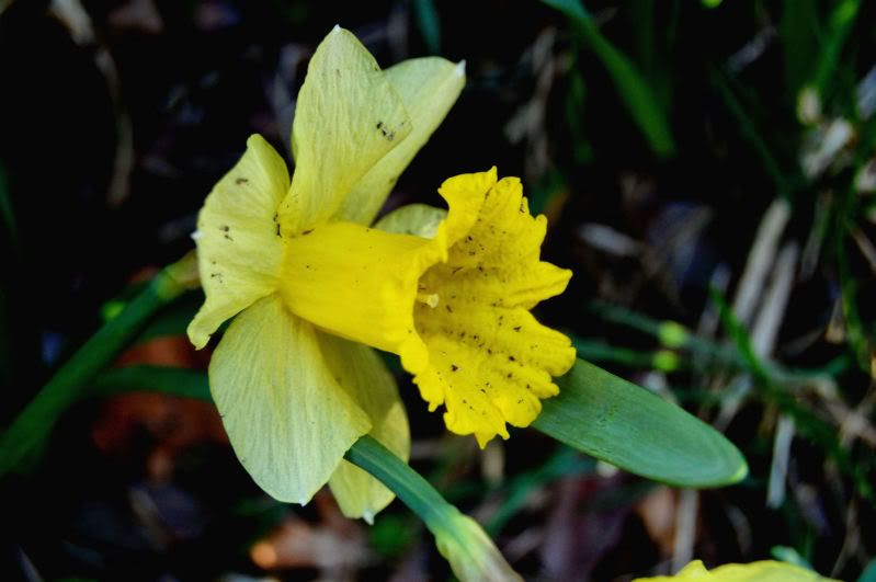
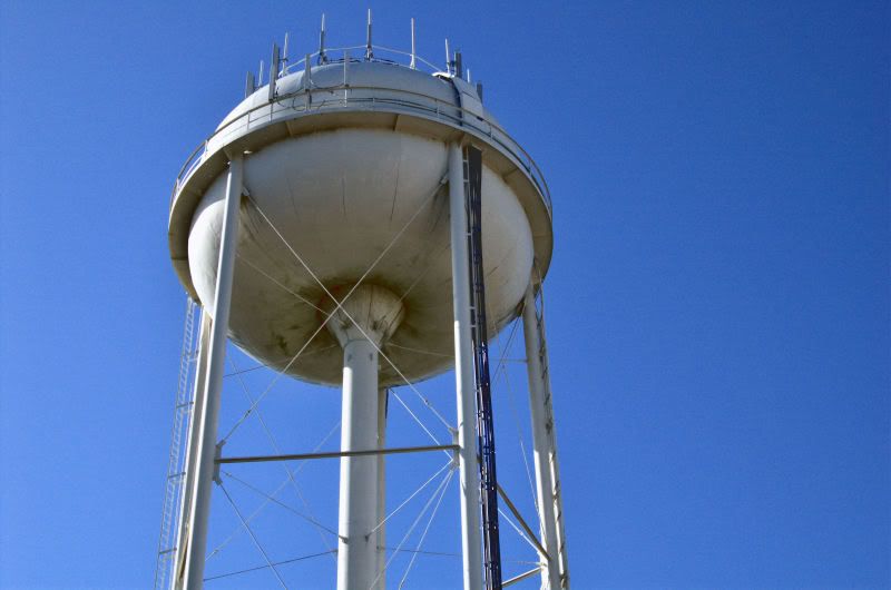
daffodill.jpg


Image0154.jpg


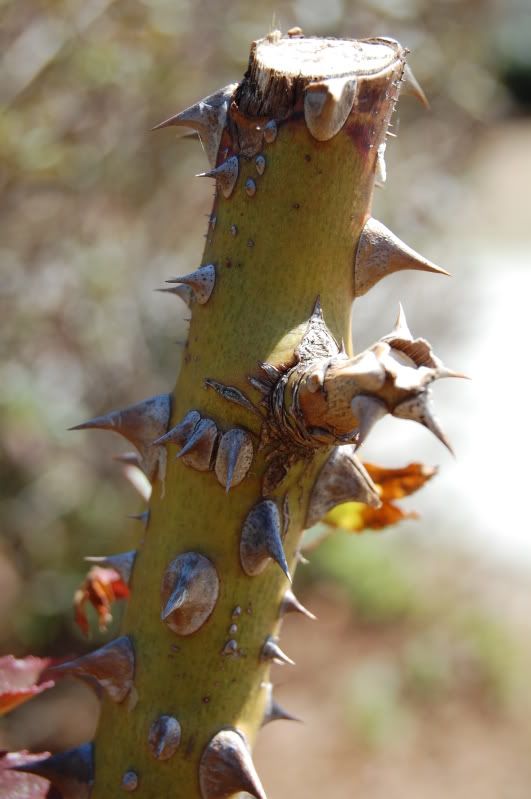
playing with DOF some, think i needed a lil lower fstop
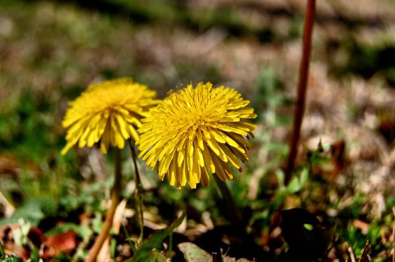
Image0006.jpg
 
The last one seems a bit under exposed.
 
The last one seems a bit under exposed.


youre right, its a bit dark at the stem and certain areas, this was just a product of me playing with shutter speed, etc. my main focus on this was to get the bloom itself to pop, didnt really work like i wanted obviously.

this is my 3rd day with the camera, and only had about 2-3 hours worth of reading. haha i got a longggggg ways to go :lmao:
 
You pretty much have the same problem as I do with the 18-55mm lens. Its hard, if not impossible to get a nice back ground blur. Your 3rd picture looks like the blur was done with editing software.
 
You pretty much have the same problem as I do with the 18-55mm lens. Its hard, if not impossible to get a nice back ground blur. Your 3rd picture looks like the blur was done with editing software.


i actually have no problem with that shooting things fairly close with a larger fstop

and no on the 3rd pic. here is the untouched original

Image0006.jpg


and here is another one with a lot of blown out spots but similar DOF

newpi003.jpg
 
The second one doesn't do anything for me. The third one I think is the strongest of the 4 but like the others said, the third is still underexposed slightly.
 
The second one doesn't do anything for me. The third one I think is the strongest of the 4 but like the others said, the third is still underexposed slightly.


i definetly agree. its just blah, bland... nothing special. the only reason i shot that is b/c i wanted to practice exposure settings with sunlight beaming on one side so i dont get washed out areas and figured it would be good practice.

thanks for the input though, i highly agree.

youre right on the 3rd one as well, i didnt know how to change the shutter speed or fstop when i took that pic, i honestly... had no clue what they were :( pathetic i know.

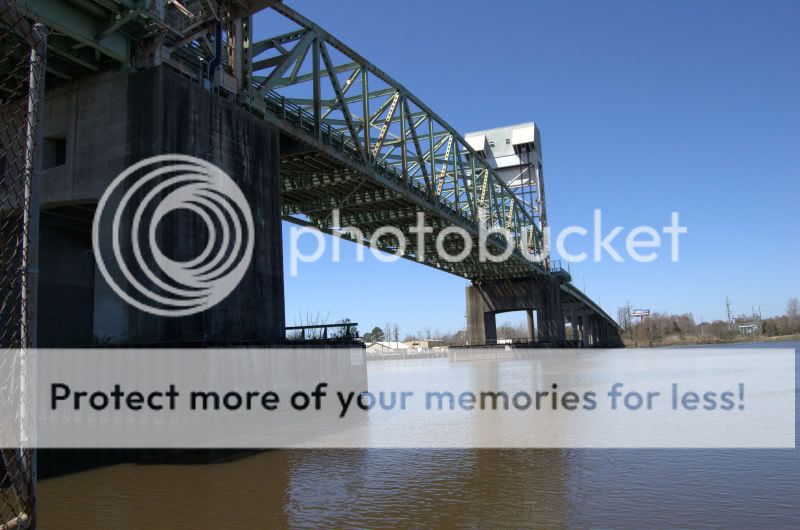
heres another i took today, the sun was directly beaming on the farther out upper tower, obviously a little washed out and some of the detail of the grates on the siding is lost, but its the best i could do :(

thoughts?

Image0255.jpg

That is quite nice! Is that an original from the camera, or did you do any post processing in Paint Shop Pro?
 
That is quite nice! Is that an original from the camera, or did you do any post processing in Paint Shop Pro?

thanks, the horizon is quite crooked, but oh well. i did a little playing in PSP. i still have a lot of editing to learn, this is just what i thought looked decent.

here is the original

Image0255-2.jpg
 

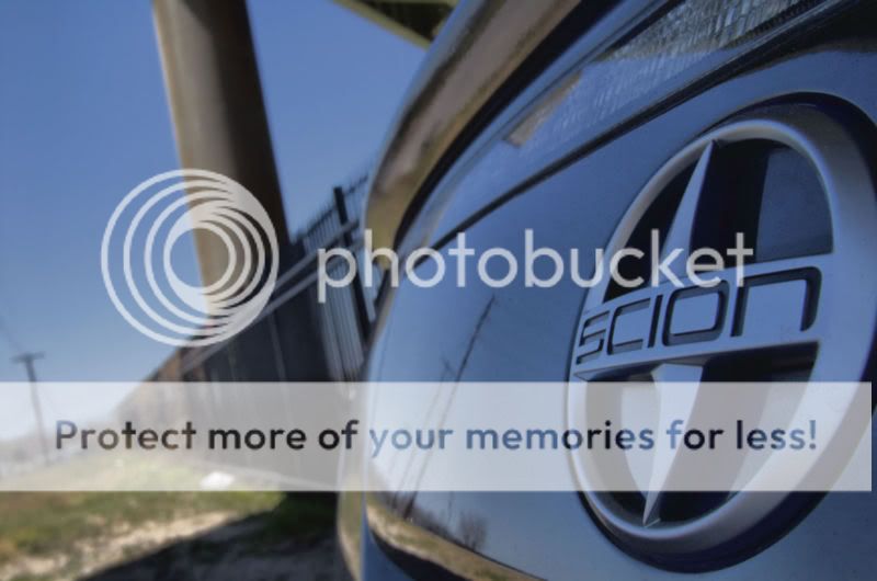
My only comment is that, any way to position this shot so you get the Scion logo in sharp detail, then just going back to either one of the brake lights?

Basically, the angle of the shot should include less landscape/ground, and should be filled more with the car.

Oh yeah, on the D40 (I just picked up the D60 yesterday) - I would recommend paying attention to focus on those shots. The Scion logo can be much sharper, with a nice blur going towards the background of the shot.
 
For the bridge photo, if you're going for detail then you shot in ideal lighting. But if you're shooting for the form and linear elements of it, you should shoot in lower lighting (dawn or dusk). In my opinion, most landscape or architectural photos have more impact shot in softer lighting. I don't like to shoot in the middle of the day as the lighting can be harsh and doesn't let the colors do the talking for the image. Being that the colors in the shot aren't that great anyways, you may want to consider running a B&W filter on it. Just my two cents.
 
For the bridge photo, if you're going for detail then you shot in ideal lighting. But if you're shooting for the form and linear elements of it, you should shoot in lower lighting (dawn or dusk). In my opinion, most landscape or architectural photos have more impact shot in softer lighting. I don't like to shoot in the middle of the day as the lighting can be harsh and doesn't let the colors do the talking for the image. Being that the colors in the shot aren't that great anyways, you may want to consider running a B&W filter on it. Just my two cents.

not sure what a B&W filter is but ill look into it.

i tried to get up early to shoot the bridge but being its my only day off i slept past prime time dawn shooting lol.

i definetly agree its not the correct lighting but i figured id learn with what i had at the time. i just wanted to get a decent exposed pic from it :D

thanks for the comments
 
My only comment is that, any way to position this shot so you get the Scion logo in sharp detail, then just going back to either one of the brake lights?

Basically, the angle of the shot should include less landscape/ground, and should be filled more with the car.

Oh yeah, on the D40 (I just picked up the D60 yesterday) - I would recommend paying attention to focus on those shots. The Scion logo can be much sharper, with a nice blur going towards the background of the shot.

you know, i didnt even try. ill give that a shot sometime. i just was playing today as its the only "real" day ive had shooting
 
not sure what a B&W filter is but ill look into it.

Black and White. Sorry, I should have stated it. You can do this in most photo processing programs if you're using one. Your camera may even have the option to shoot in B&W too, just check around your menu.
 

Most reactions

New Topics

Back
Top